Top 5 Hand Lettering Mistakes {& How to Fix Them!}
Hand lettering is one of my favorite ways to create art, and I love sharing it with others through my website and books. I’ve also been teaching a ton of in-person workshops lately, and I’ve noticed that there are some very common mistakes that are both frustrating and really easy to fix!
Today, I’ve put together a list of the five mistakes I see most often, especially when folks are just starting out with lettering. If you’ve been getting frustrated by any of these things, I hope that as we talk through them together, you’ll be able to get back on track and enjoy this hobby as much as I do!
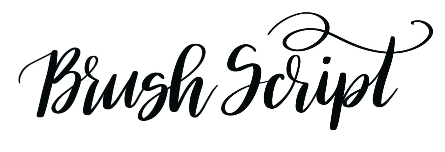
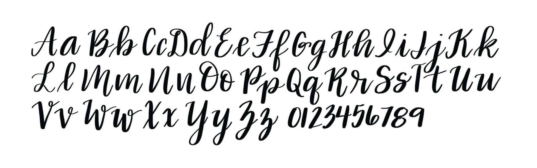
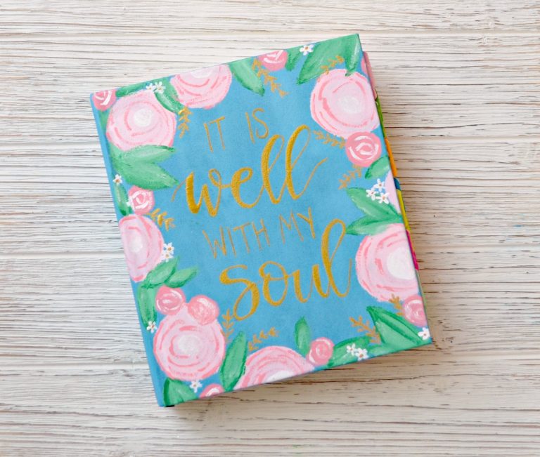
Ready? First, we have to quickly define just what we’re talking about by “hand lettering” in this particular post. While hand lettering actually encompasses tons of different fonts, techniques, and embellishments, what we’re referring to today is the most popular lettered font, Brush Script.
In this style, each letter is made up of a combination of thick and thin strokes. There are two ways to achieve this look: one is by using a brush pen and controlling the pressure you apply to the pen’s tip while making the different types of strokes. The other is faux calligraphy, an easy technique where you write a word normally, then go back and draw a second line where your thick lines go, coloring the space between the lines to make them thicker and darker than the rest. For full instructions, check out my Brush Lettering series, my Faux Calligraphy post, and/or my book Hand Lettering for Relaxation. With that in mind, let’s tackle these tricky trip-ups.
THE FIVE TOP HAND LETTERING MISTAKES
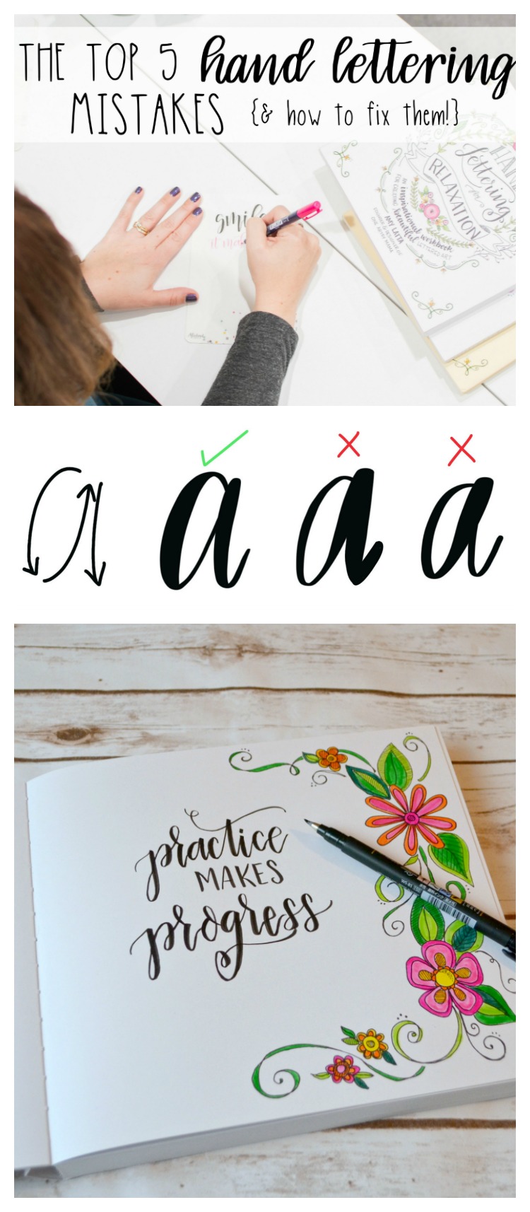
1. Thickening the wrong part of the letter.
Whether you write using the true brush technique or by doing faux calligraphy, there’s one important rule you need to follow. The downstrokes in the letter {anywhere the pen was moving down toward you while writing} are the thick parts. Upstrokes and horizontal strokes remain thin.
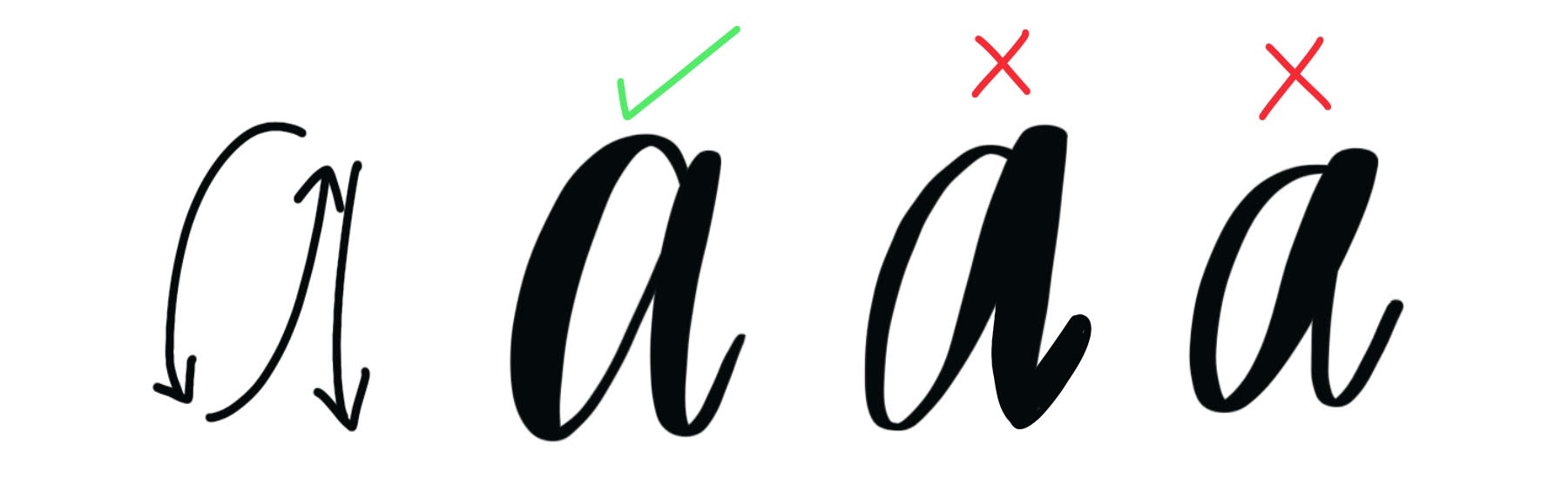
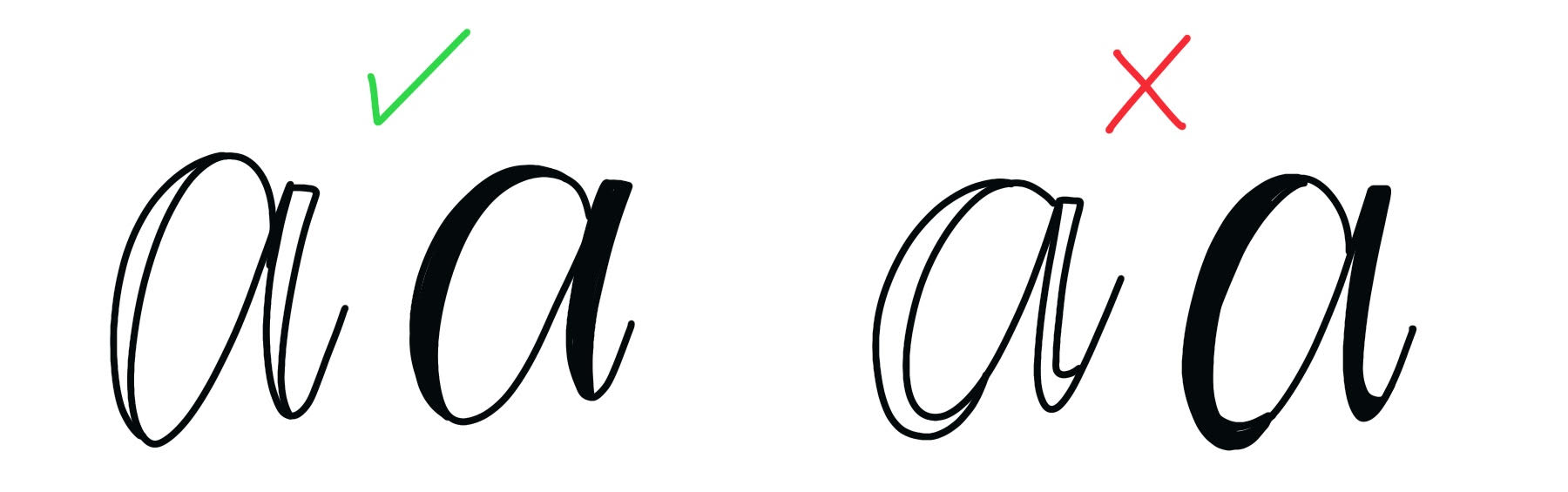
If you follow this rule, your letters will be pleasing to the eye. If, however, you just randomly pick and choose parts of letters to thicken, your word will look “off.” See how in the example below, there’s no balance between thick and thin and no pattern to where the thick lines fall?

Now, let’s rewrite the phrase while following our rules. Wherever we find a downstroke, we’ll make the line thick and wherever our pen moves up or horizontally, we’ll leave it thin. Take a look at the difference!
Finding which parts of a letter are downstrokes can be a challenge, especially when you’re first starting out, so here’s a quick reference alphabet. You don’t have to form your letters just like I do, but it will show you where the thicker parts of each letter should be. As you practice, you’ll begin to memorize these, and it’ll become second nature to put those thick lines in the right places.
2. Extending the thick part of the letter too long.
Another problem that can happen when forming your brush script letters is that you start out thickening the downstrokes, but then get too much of a good thing. The key is that the thickness stops as soon as the pen starts moving upward again. I often see folks, especially when they’re learning the faux calligraphy method, who take that double line just a little too far, like all the way around the curve at the bottom of a letter. Take a look at the examples below. See how the one one the left stops before you reach the bottom-most point of the curve? This is the look you’re going for. In contrast, the one on the right has been thickened too much.
The same thing happens when using the brush technique too. The trick is to press hard on your pen as it’s moving downward, then release as soon as {or even slightly before} you get to that magical spot at the bottom. Take a peek at the diagram and samples below; you’ll see what I mean.
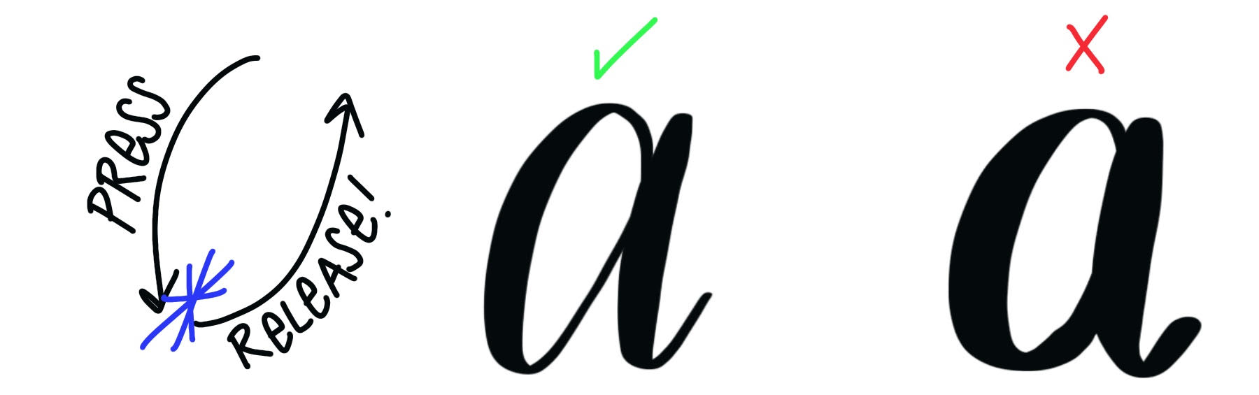
I often find that when artists say their letters don’t look right, it’s because this is happening. Make sure to stop the pressure or the double line before your pen changes direction, and you’ll find that you like the result a lot better!
3. Being afraid to pick up the pen between letters.
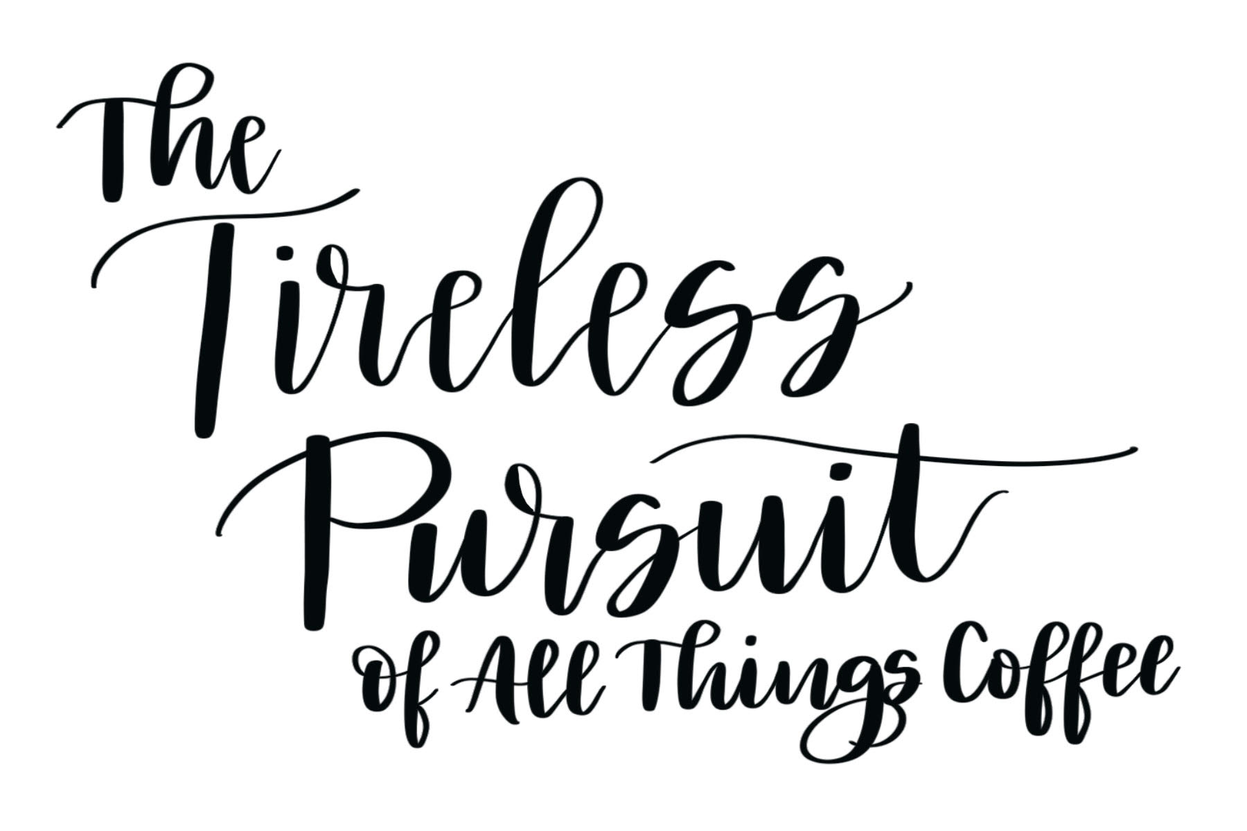
Although the letters in brush script connect to one another, it’s important to remember that brush technique is not cursive. We are taught when writing cursive to keep our pen on the paper at all times until we finish a word. However, when we hand letter, that rule no longer applies. In order to make our connections look the way we want them to, it often helps to pick up our marker or pen every other letter or so. For example, when I write the word “phone” in brush script, I do it in three separate segments.

Because I write the new segment next to or even on top of part of the previous one, everything looks connected, even though I lifted my pen in the process. As you practice, allow yourself to pick up your pen whenever you need to…no one will ever know!
4. Using the wrong supplies.
You absolutely do not need to invest a small fortune in expensive supplies to get great results when lettering. However, you do want to make sure you’re using the right tools for the right jobs. Believe it or not, the most important supply you’ll use is your paper. I recommend a very smooth, medium-weight sketch paper for practice, and hot press watercolor paper or bristol board for projects. Yes, you can use your kids’ notebook paper or grab computer paper from your printer, but the markers will react with it differently and keep your lettering from looking its best. Using “regular” paper is also harder on your markers and can shorten their lifespan, causing brush markers to “fray” and other markers to dry up faster.
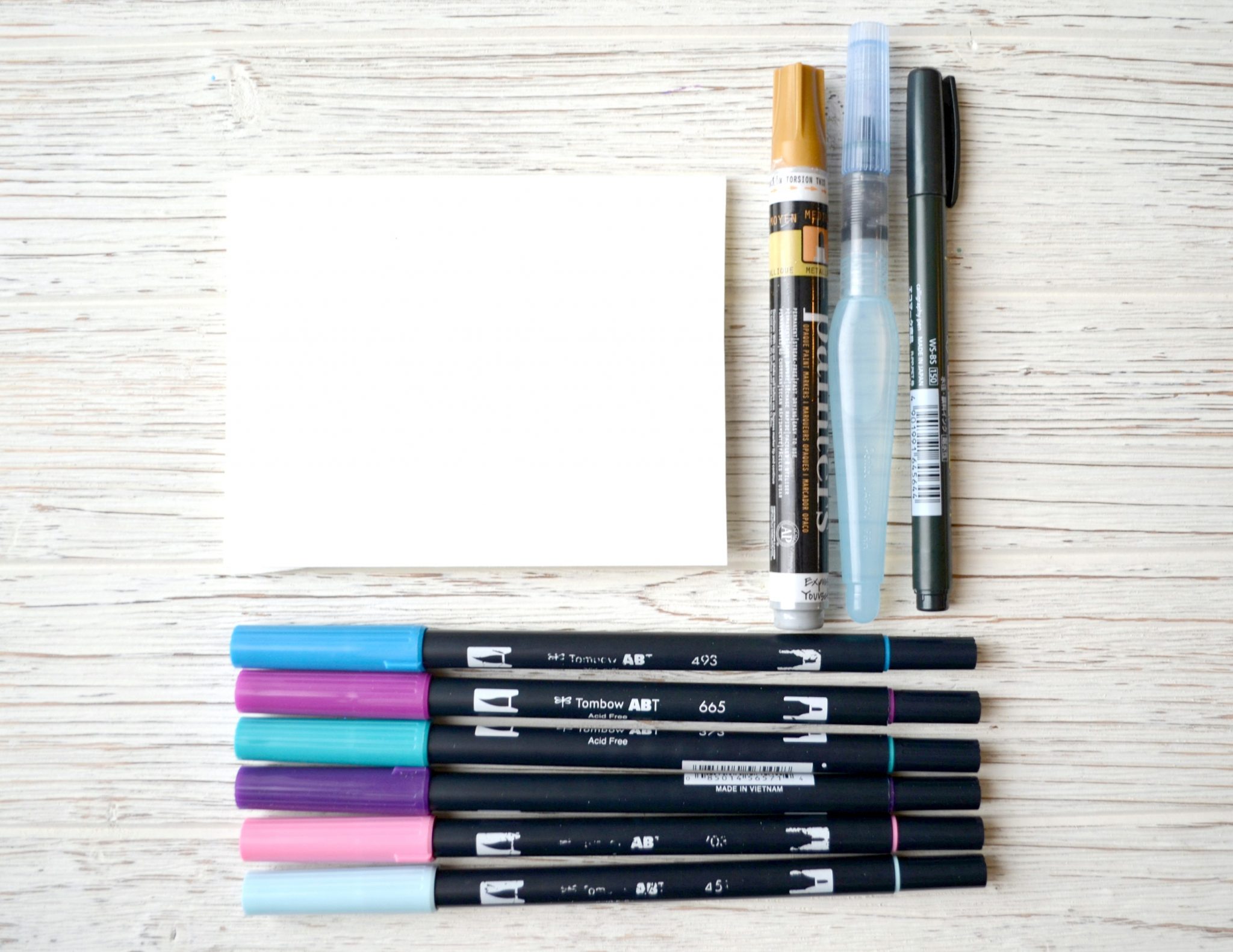
Also, if you’re trying your hand at the “real” brush lettering technique, make sure you’re using a brush pen. Other markers have different types of tips and aren’t designed for the job. I recommend the Tombow Fudenosuke and Tombow Dual Brush Pens. To see a full list of all my favorite supplies check out my Amazon List! Or, if podcasts are more your thing, check out my episode all about Hand Lettering Supplies.
5. Being your own worst critic!
If you’re feeling discouraged about your lettering, there’s a good possibility that the biggest problem you have is your mindset! I often find that folks expect to pick up a pen and become a lettering Picasso in an hour and a half, and that’s just not reality! Like any other skill, lettering takes time, repetition, and practice to master. I’ve been doing this for over three years, have written four books on the subject, and I’m still learning new skills all the time.

The more you practice, the better you’ll be. Don’t give up after one attempt that doesn’t turn out the way you imagined. Don’t decide that your lettering is terrible compared to the person next to you or to someone you follow on Instagram. The comparison game is something no one ever wins! Instead, embrace this as a journey. It’s about finding your own style, not becoming someone else. It’s about being better today than you were yesterday. Give yourself some grace and remember that everything that’s worthwhile takes time. Above all, don’t give up. The world needs all the beauty and creativity it can get!
I hope this quick discussion helped you to identify which of these mistakes you might be making, and more importantly, how to fix them! For more lettering tutorials, practice pages, and projects, be sure to check out the Hand Lettering section of the website. Also, stop by the Amy Latta & Friends Facebook Group so we can chat and I can answer your lettering and crafting questions. See you there!
Don’t forget, if you like it, then you oughta put a Pin on it!


Thank you for this. Have been trying to get started but am hitting some of these hurdles. Going to keep these in mind when I give it another try.
Yay, I’m so glad you found it helpful! Good luck! I know you can do it.
This is really great! Thanks dos sharing your knowledge!!! : )
My pleasure!
Thank you so much for this tutorial. I am a longtime fan of, to put it simply, beautiful hand writing and lettering. Faux-ligrophy is the best! Your video helped me to learn the proper strokes and placement for my lines with results that are better than ever. And the best part is the information, when after trying for quite a few years, but with your lesson, I am able to make proper corrections instead of guessing. Thank you!
I am so glad to hear this!!! <3