Beginner Brush Lettering: Basic Brushstrokes
 Hey, friends! If you’re here I’m guessing it’s because you really have an interest in learning the art of brush lettering. Hand lettering, in all its forms, is my obsession these days, and on the blog I have archives full of all kinds of techniques including embellishments and a super-simple faux calligraphy that gives the look of brush lettering without requiring you to learn the technique at all. But if you’re interested in the “real deal,” the art of brush lettering, here’s where we start. Grab a pen and some scrap paper, roll up your sleeves, and let’s do this!
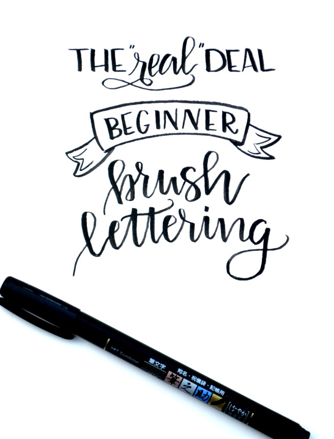
You need:
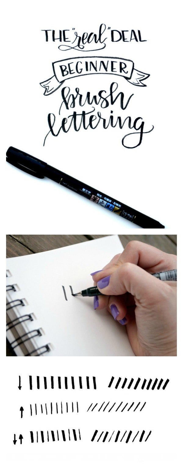
a brush pen {I highly recommend the Tombow Fudenosuke Soft Tip for beginners}
paper
Here’s the deal.
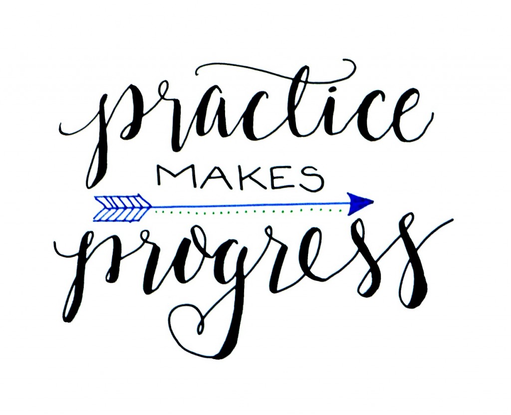
The key to this whole thing is changing the position and pressure of your pen as you write. It sounds so simple and yet mastering the technique can be a real challenge and just plain frustrating at first! My best advice to you is don’t give up. Practice makes progress and every time you practice, you’re getting it into your muscle memory, just like riding a bike, dancing, or anything else you do.
And to be clear, YES you need a BRUSH PEN. A regular pen, pencil, or marker will not work. You can do beautiful faux calligraphy with those things, but you absolutely need the right tool for this technique.
First things first.
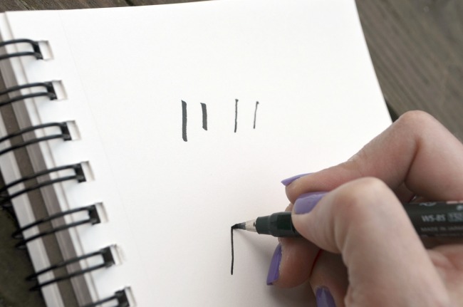
Before you can write words, you have to write letters. Before you can write letters, you have to write lines. Brush lettering is characterized by thick lines on the down strokes of letters and thin lines on upstrokes. That means each time you move your pen in a downward motion, you have to create a thick line based on the angle of your pen and the amount of pressure you use. So far so good?
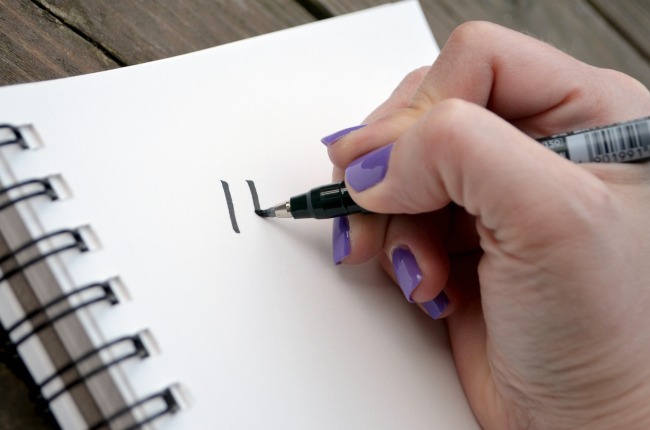
Take your brush pen and hold it at about a 45 degree angle to the paper. Using firm pressure, make a series of down strokes to get a feel for this. Don’t worry about pushing too hard; your pen was made for this. See in the photo how the tip of my fudenosuke pen is flexed? That’s what’s supposed to happen. Keep on going and making these lines. They should be similar in width because you’re applying the same amount of pressure. Fill a whole page with these lines.
Really.
Do it.
I’ll wait.
I want you to really get a feel for this…how you’re holding the pen, how hard you’re pressing, and how the pen responds.
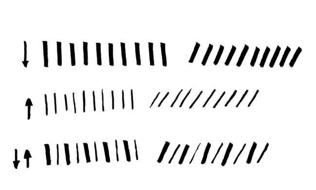
Now, once you’ve got a page of downstrokes, it’s time to tackle the thinner line, the upstroke. This time, you’ll be holding your pen a little higher off of the paper, closer to 90 degrees than 45. Why? We only want the tip of the pen to draw this time, so the less of it that touches the paper, the better. We’re going to use lighter pressure and move the hand in an upward motion. The brush tip will still flex as you move it, but you’ll get a thinner line, see?
Now, do that a million and seven times. I’ve got all day.
Horizontal lines are done the same way, with light pressure and just the tip of the pen on your page.
I really want you to play around with these lines and get a sense of how it feels to create them. You’re probably thinking, “let’s get on with this, I want to letter,” but remember…words are made up of letters which are made up of lines. We have to really get this part under our belts before moving on or it’s only going to lead to you getting frustrated and throwing things. Trust me.
In your sketchbook, try making them vertical as well as diagonal. Make a series of downstrokes, a series of upstrokes, and then when you’re starting to feel like they’re pretty consistent overall, it’s time for a new challenge – alternating them. Down, then up, down, then up. I’m completely serious when I tell you to fill a whole page {or two or three} with this. The more your hand does it, the more your muscles will remember how.
Moving on to letters.
I know, I know, I know. You want to write in the fancy script. We all do. That’s why you wanted to learn this in the first place. But here’s the thing. The way some of those letters are formed isn’t the same as the way you naturally form them in your own handwriting. So you’d have to learn this new technique plus the new letter shapes simultaneously, and that doesn’t set anyone up for success. Instead, we’re going to start by simply combining the straight lines you already know how to make and creating some basic uppercase print. This will allow you to practice on something you’re already comfortable with, plus you can always combine print and script in your projects to make them more interesting.
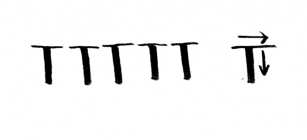
Ready? We’re going to start with a capital T. All you have to do is make a vertical downstroke, and then a thin horizontal stroke to top it off. Make a whole row of fabulous “T”s.
Now we’re going to step it up a bit and try combining upstrokes with down. To form a capital A, you’ll make a diagonal upstroke, a diagonal downstroke, and a horizontal cross bar. You can pick your pen up in between the up and down strokes, but eventually you’ll want to just keep it moving on the paper and change the pressure as you go. Time to make a bunch of these A’s! You’ll notice that every now and then one will turn out less awesome, but that’s how this works. Look at my poor guy four A’s in from the left. Totally wonky…and I’m the professional! So don’t worry about it, just keep going.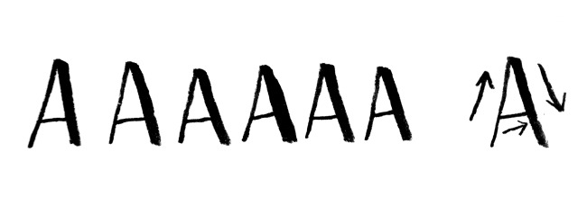
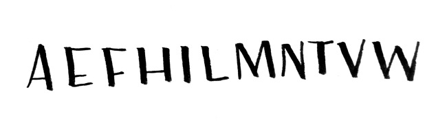
Here is a list of capital letters that are great for practicing these strokes. Play around with them, fill pages of your sketchbook with them. As a side note, you’ve probably noticed that my letters here aren’t exactly straight. That’s because of who I am as a person – impatient! It’s the truth. I was too excited about posting this for you to take the time to draw pencil guide lines and look what happened. Sorry.
Lettering basic words.
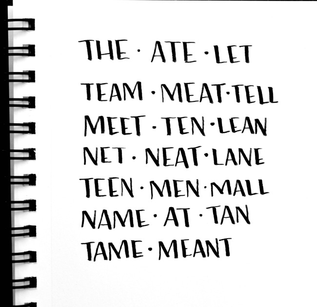
Are you ready? I can’t hear you! Let’s take some time to combine the letters you’ve been practicing into some simple words. You can even make funny sentences if you like…The tan teen team ate lean meat. Amuse yourself. But above all, practice.
In case I haven’t emphasized it enough, practicing these strokes is the absolute key to your success at brush lettering. Once you can do this, you can write anything. I promise not to leave you hanging here, we’re going to move on step by step to look at how to handle curved lines and yes, how to form those lovely script style letters we all adore. In the meantime, get to work, cupcake! Fill that sketchbook! The more you practice, the more you’ll progress. Promise.
When you’re ready to move on, check out the next post in the series: Learning Curves, and post 3: Rounded Letters.
Questions? Join us on Facebook at One Artsy Mama and Friends and ask away.


Thank you for this! And for emphasizing patience and your mistakes….it really is hard! I always thought I had horrible handwriting and never considered I was even capable of getting better. This makes me realize it is 100% possible 🙂
Oh, thank you for taking the time to leave a sweet note, Lara! You absolutely CAN do it!
I love this post…You make it so “doable”
Thanks for doing this…I’ve been practicing…
Looking forward to more lessons… 🙂
You rock! Thanks for the helpful tips and encouragement, Amy 🙂
Thanks for this! I am on Day 10 of a 100 Days of hand lettering project (for the 100 day project on IG) and this has come in very handy! I love how you really broke this down and explained the basic building blocks. I filled up three pages already!
I’m so excited to hear that!! Glad you are finding it helpful! Be sure to check out the second and third posts in the series too for more tips!
Where do you purchase these pens?
I get them on Amazon, Diane! If you click on the name of the pen, it should take you right to where you can purchase them.
Great tutorial! I really want to create brush art like this and scan it into vector graphics to sell. Thanks for sharing.
This is awesome! Thank you for sharing! I am on my way to pretty hand lettering now! Woo Hoo!!
YAY! So glad you found it helpful!!
Is there any kind of particular sketchbook you would recommend for lettering? I have one I started practicing in but my tombow pen bleeds on the paper.
Look for something that’s as smooth as possible and at least medium weight…70 lb or higher! Hope that helps.
Is the market permanent? I would like to watercolor over the writing without running. Thank you!
This one is not, but you can certainly use a permanent marker.
beautiful dying to start this just ordered the black pens you recommended, can you use copic markers for the colors?
what kind of spiral book are you using?
Thank so much
I’m sure you could use copic. I just use a medium weight sketch pad.
This is a wonderful guide thank you so much for the free chart I have been looking every where for one
You are very welcome! Happy lettering!
hi again!
this is what I was looking for! I just somehow got into the middle of things.
Now I’m at the beginning.
Excited to give this all a try.
thanks and blessings
Barb
Thank u so much… For 2018 I have decided to learn hand & brush learning & your tutorial is the one I started with. You make it sound easy & it’s actually so doable & that part is Tru, par time to achieve perfection.. Thanks once again, I am coming back again again & please keep posting beginners guide I need it to fulfill my learning goal this year.
You are very welcome! Do you have my book?
I can’t wait to start ! I just ordered my pens , I have been fascinated with calligraphy for the longest now and I finally bit the bullet and going to try it ! Any good tips for a beginner ?
Yay! Have fun! You’re going to love the pens. I’d encourage you to hop on over to Facebook and find our group, Amy Latta and Friends. We share photos and tips and questions there, so you can ask away!
Hi Amy do you have free practice sheets for bounce lettering? This is the only lettering I have a problem with. Thank you for all your hard work. I really have learned a lot!!!! Luv sue
Hello
Is there a computer font name, for brush lettering that you recommend for print outs?
Thanks!
I like “Saturday Script.” I also sell fonts on Creative Market: Latta Print and Noelle Script.