Hand Lettering: Choosing Your Fonts
One of the most frequent questions I get when teaching hand lettering workshops is how to choose what fonts to use in a design. Today, I want to try and offer a few simple tips to help you decide what lettering styles to use in a given project. Let’s get started.
Divide your quote into lines and identify the most important words.
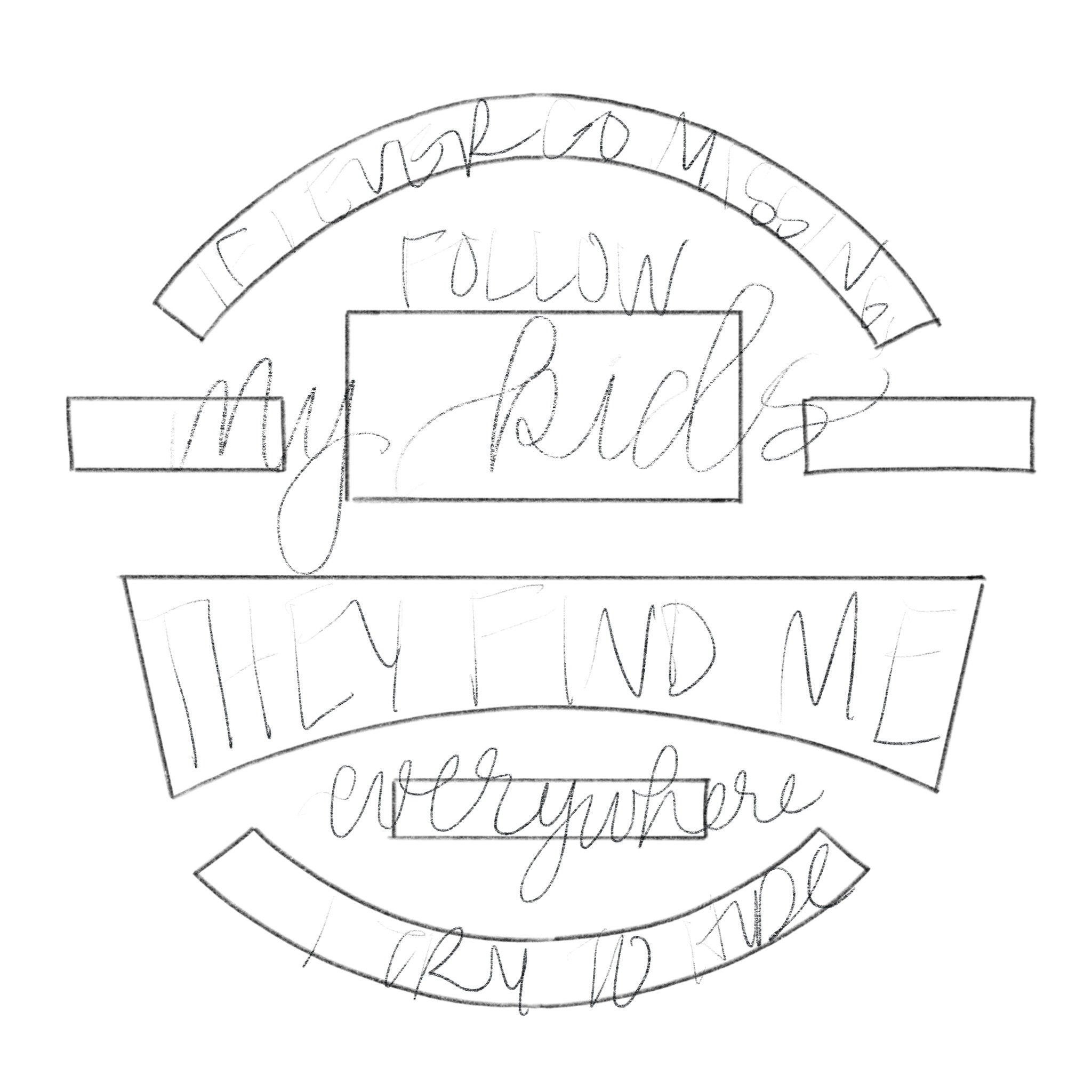
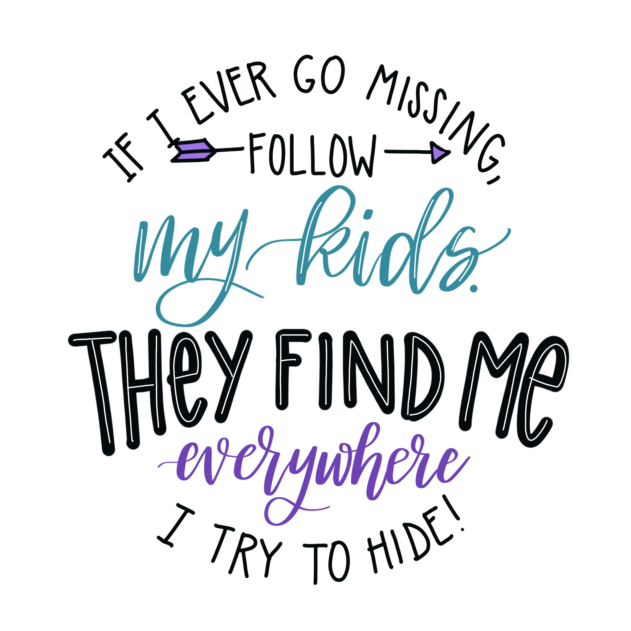
For example, let’s look at the quote: “If I ever go missing, follow my kids. They find me everywhere I try to hide.”
The words I’d want to emphasize are “my kids,” and “they find me everywhere.”
Important words should be large and bold.
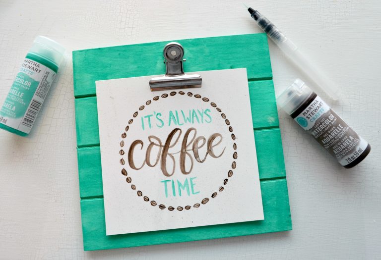
Typically, I use either brush script, or a bold print. Check out my Faux Calligraphy and Brush Script tutorials for more on how to do that style of lettering. You can find more tutorials for all of these styles in my hand lettering books, Hand Lettering for Relaxation and Hand Lettering for Laughter!
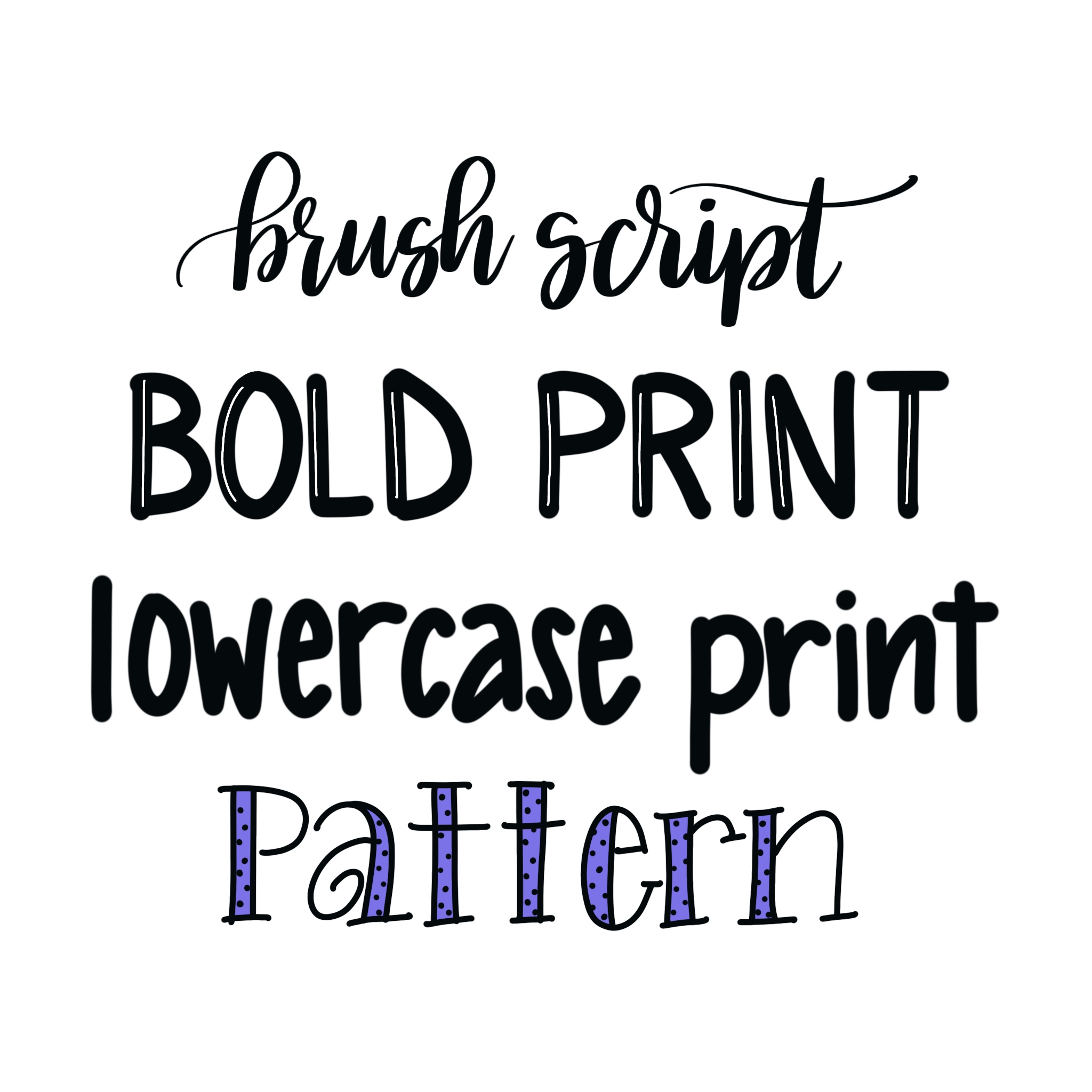
While brush script is usually my favorite style, I tend to use print if I want my word to take on a particular shape. Print letters, especially when they’re all caps, are easier to manipulate and form to geometric shapes than script letters are.
Choose one or two other fonts that complement your original choice.
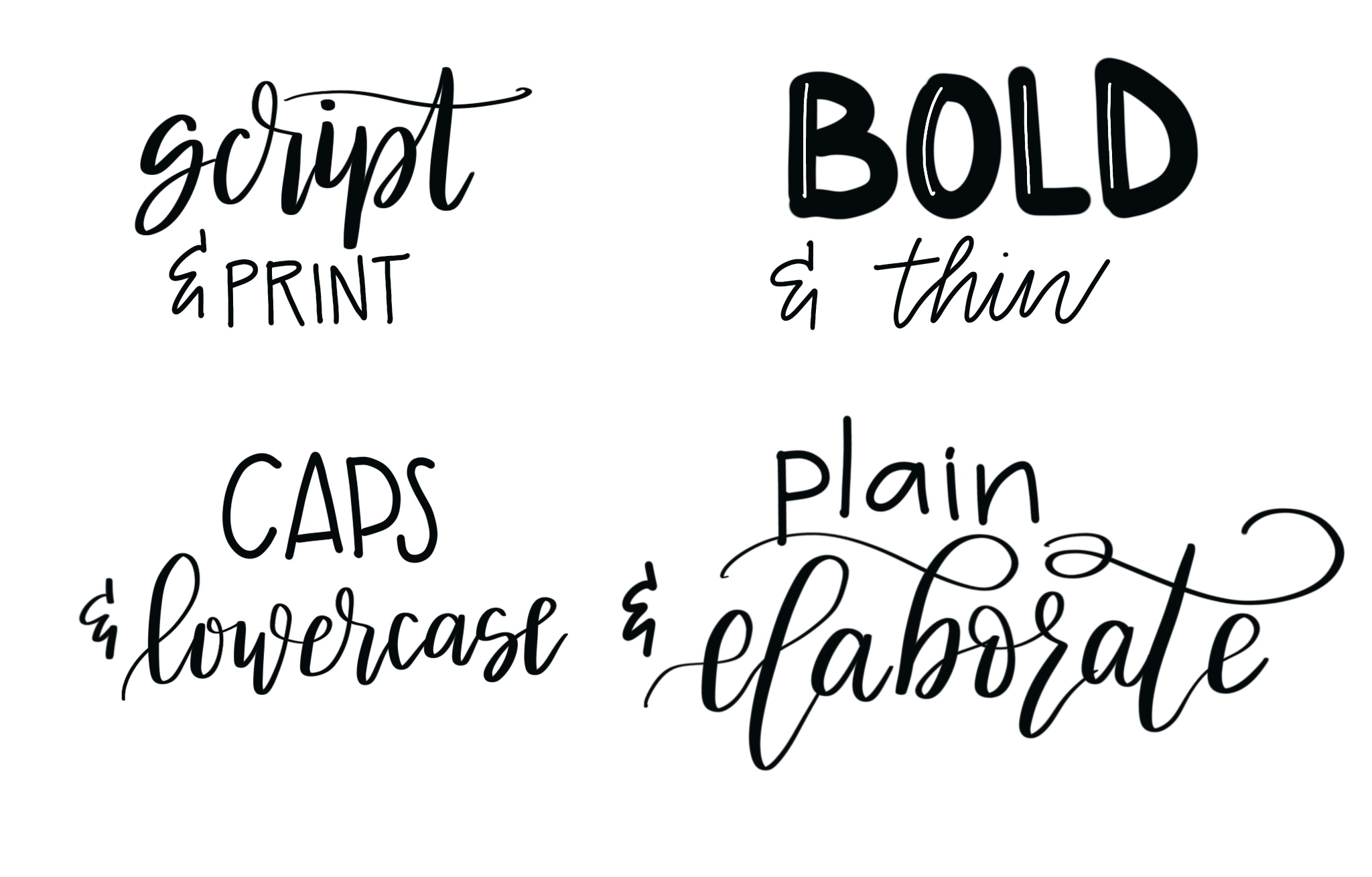
Typically, when it comes to design, opposites attract. If you write your main words in brush script, you’ll want to print the less important ones, and vice versa. Bold words pair nicely with thinner ones, and fancy elaborate lettering combines nicely with a clear and simple font. I tend to stick to two or three fonts per design, because more than that tends to be too “busy” and becomes difficult to read.
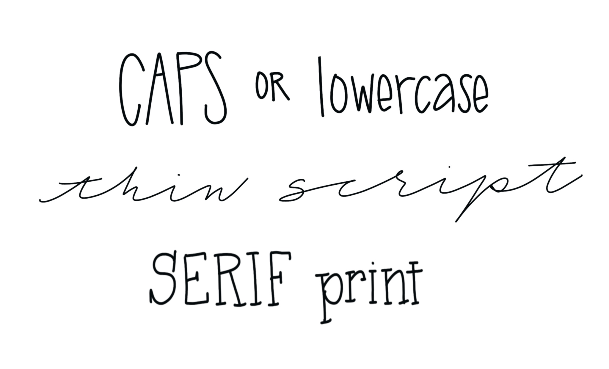
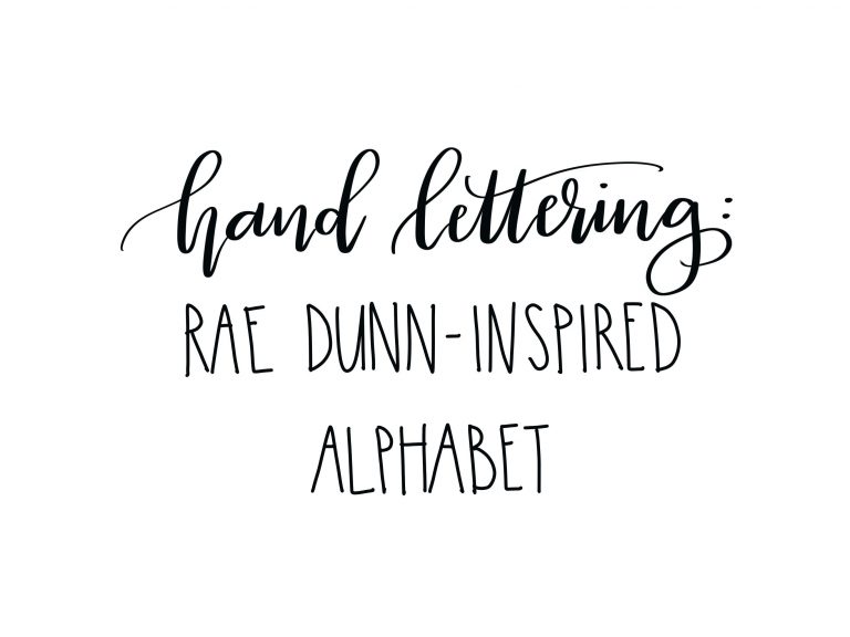
Here are some of the fonts I typically use for the “filler” words that go in between the most important parts of a quote. Click here for tutorials on the Caps/Lowercase Rae Dunn Style print and the Serif Print. You can find more tutorials for fonts like these in my books too!
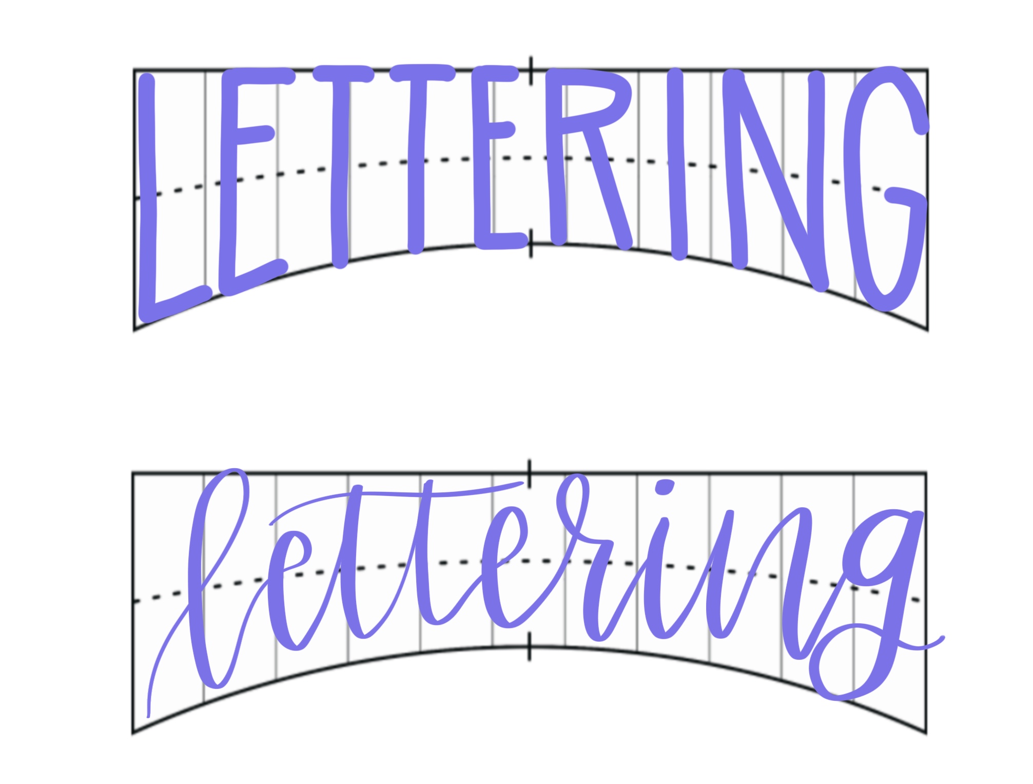
Sketch your design in pencil.
Make sure you like the combination of fonts together and that your eye is drawn to the parts of the phrase you want to emphasize. If you’re satisfied, go ahead and use markers to finish your design and erase your pencil lines when the marker is dry. Here’s a quick look at my sketch of the quote from the beginning of the post. I used brush script and a bold capital print for the main words and my thinner capital “Rae Dunn Style Print” for the rest. You can see that it’s a VERY rough sketch, just enough to position my words and give me an idea of the sizes and shapes. For more on how to create and use a design grid like this, you’ll definitely want to check out Hand Lettering for Laughter! In the book, I go into lots of detail about it and provide sample grids for more than 30 designs!
Here’s how the final version looks once I applied the techniques and added some color and embellishment. See how the different font choices help to draw your eye to the words I wanted to grab your attention?
These are just a few basic tips for choosing and pairing fonts in your lettering. I’d love to see your projects and answer your font questions; join me over in the Amy Latta & Friends Facebook group for sharing and feedback! Hope these suggestions help you as you continue your lettering journey!
Don’t forget to Pin this post for later and share with your creative friends!
I have been inspired to try hand lettering for a few years now…something I feel the Lord moving me into! I recently attended a wonderful Lettering Workshop in my town (Madison, WI) and then found your site! Love how God is equipping me in this way. This isa perfect post as I absorb all I am learning about the variety of fonts in hand lettering. So wonderful!
Is there a typeface or font name for the “thin script”, or is that made by hand in your own style? If so, please share a tutorial on how to recreate it, if possible. Thank you so much!
That’s my writing. 🙂