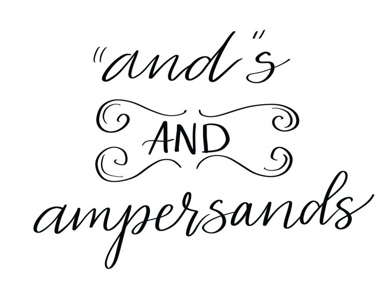
Basic Hand Lettering: Shadows and Highlights
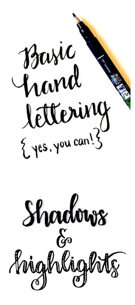
Friends, one of my favorite things about hand lettering is that every piece you create will be absolutely unique. As you practice and learn new skills, you’ll have lots of options to choose from every time you decide to letter something. Some of the the tricks I like to use often to add depth and dimension to my work are shadows and highlights. I could talk about each of these for hours, but I’m going to do my best to give you a quick overview that will get you started with both techniques.
First, let’s talk about shadows.
SIMPLE SHADOWS
The easiest way to create a dimensional effect is by adding simple grey shadow lines. All you need is a grey marker…my favorite is the Tombow Fudenosuke Twin Tip Black and Grey because the one pen has both tips I need!
All I do is write my word or phrase like normal, then go back with the grey marker and add lines just to the right of my existing ones.
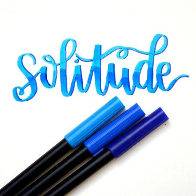
COLORED SHADOWS
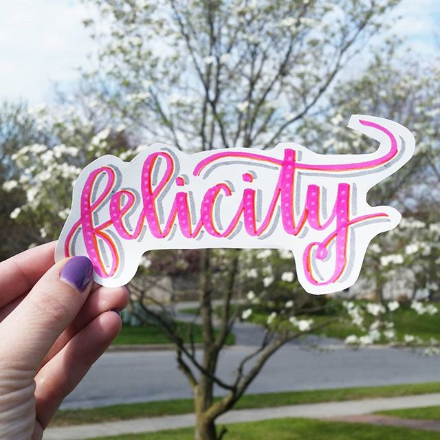
For a different shadowing effect, instead of using grey, you can try a color that’s darker than whatever color you used for writing. Typically, I choose a darker shade of the same color, but you can also choose something that’s just within the same color family. I like using the thin end of my Tombow Dual Brush Pens for this. Once again, I go to the right of the lines in my letters, as you can see in the example below.
DOUBLE SHADOWS
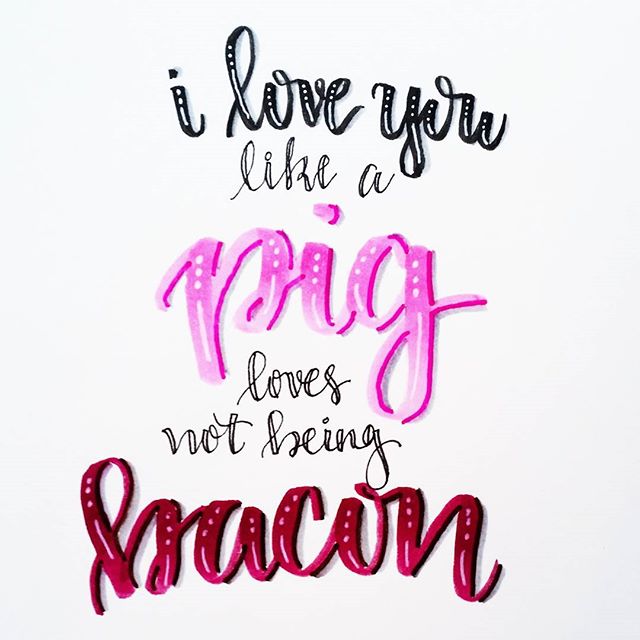
These effects can be combined too, like I did in the nursery print I created for my friend Lauren. I wrote the words “good,” “perfect,” and “above,” using the brush end of a Tombow Dual Tip marker, then used a darker marker to add accent lines. After I had done that, I went back and added grey shadows to the right of those darker lines to really give a three dimensional effect.
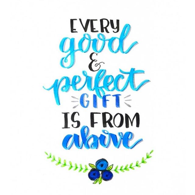
I enjoy playing around with color combinations and seeing what different looks I can achieve. Shadowing is one of the easiest ways to make certain words really stand out and to make them look like they’re jumping off the page.
Now let’s talk about adding details in the form of highlights!
BASIC HIGHLIGHTS
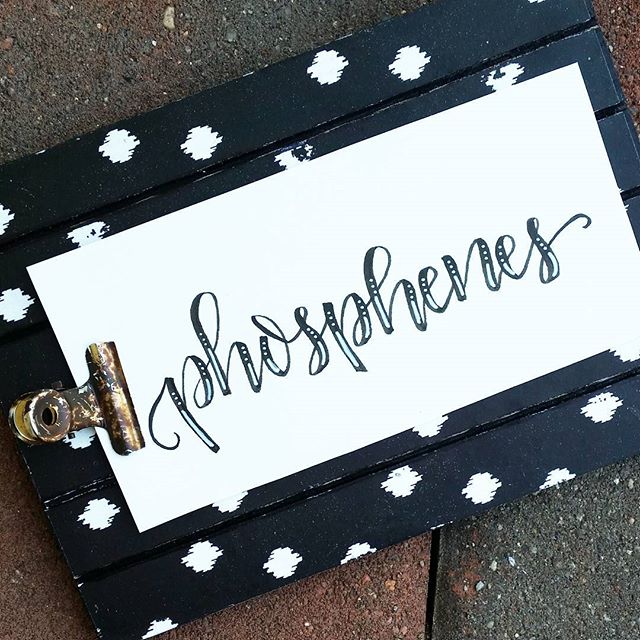
For this technique, all you’ll need is a white gel pen. Write your word or phrase as you normally would and be sure to let the ink dry. Then, go back with your gel pen and add highlight lines. My go-to pattern is to do three little dots followed by a longer line. If a letter is particularly long I might add three more dots at the end. If it’s especially short, I might do two dots instead of three. Here is an example on some simple black lettering.
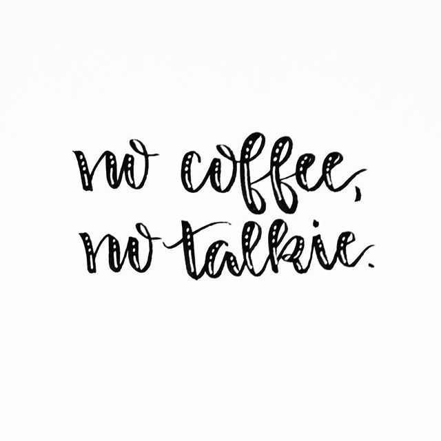
I only add highlights to the down strokes {thick parts} of the letters. If you prefer an even simpler look, you can leave out the dots and stick to just straight lines.
Or, you can skip the lines and highlight with just a series of dots! The sky’s the limit.
COMBINING EFFECTS
Now, if you really want to go all out, you can combine all the effects together. Add colored shadows, grey shadows, AND highlights for a look that really makes your lettering vibrant!
These techniques are really so simple to do but they can add so much to your lettered work. Plus, they don’t require a ton of special materials to do either. Which is your favorite?

I’d love to see what you create using shadows and highlights…or just anything at all that you’re working on! Feel free to join in our Facebook group, One Artsy Mama and Friends, and share your latest projects. It’s also a great place to get feedback and ask questions about anything art and craft related.
Before you go, be sure to check out my other hand lettering tips and techniques, including Basic Hand Lettering, the Basic Brush Lettering series, Alphabet Practice Sheet, and more. Happy crafting!
LOVE these ideas! Simple ways to really add oomph to lettering. Thanks so much.
Thanks!!
I’ve pinned all these to my Pinterest board, because I love them so much. I’m new to hand-lettering, and I think my absolute biggest downfall is not taking my time with it. Either way, I found these really inspiring <3 Thank you for posting this!
Oh, thank you so much! I’m glad the posts are helpful for you! Just keep on practicing…practice will definitely make progress!
Wonderful post! I am currently obsessed with brush lettering, and yours is so nice! I also love how our blog names are similar, and we both like pink. 🙂
Thanks for stopping by! I’m glad you enjoyed the post!
Muito bom essas técnicas. Ótimas idéias.
I love your lettering. I pinned some to Pinterest, I hope that’s okay?
Of course! Pin all you like!
Super tips and your blog is very nice.
I love the combination of photo and handletterings. Will give it a try, too!
Love the highlighting technique… Do you have any tips to keep the white gel pen highlights from looking muddy?
Make sure the marker underneath is totally dry before you add highlights! If it’s still wet at all, the white won’t be as crisp!
Thanks! That’s kind of what I figured, but patience is NOT among my gifts, lol 😉
Hi
this is a great tutorial, but I am looking for the basics. How do you learn to write in the fun font that is in the last picture? is is freehand? do you put a pattern on?
I’m searching the internet for help. found you.
blessings and thanks
Barb
Can you tell me what kind of markers/pens you use? I’m new to hand lettering, and don’t know where to start!
You can find a list of all my favorite supplies here!
https://www.amazon.com/shop/oneartsymama
Hi,
Many many thanks for sharing such a useful ideas. I really appreciate your wonderful explanation. I will certainly dig it and personally suggest to my friends. I’m sure they’ll be benefited from this website.
Super tips and your blog is very nice.
I love the combination of photo and handletterings. Will give it a try, too!
great!