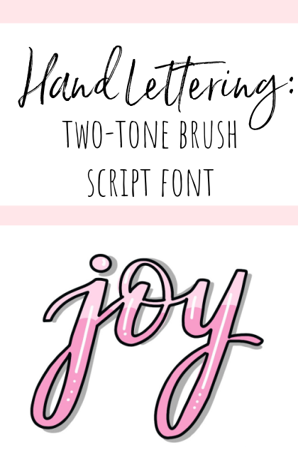
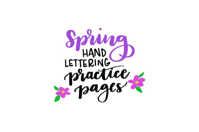
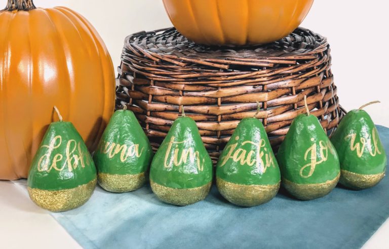
Hand Lettering: Two Tone Brush Script Font
Ready to take your lettering to the next level with a fun and colorful new font? Grab your markers and let’s create this two-tone brush script! Take a look…
You’ll need:
brush pens in 2 colors (I recommend Tomow Dual Brush Pens)
fine tip black marker (I recommend Tombow Mono Drawing Pen 05)
white gel pen (I like the Signo Uni-Ball)
Step 1: Choose two colors for your lettering.
I recommend either a lighter and darker shade of the same color, but you can also use colors that blend well, like blue/purple, purple/pink, green/blue, red/orange, etc.
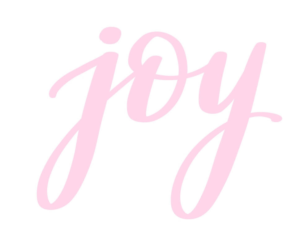
Step 2: Using the lighter of the two colors, write your word in brush script (or faux calligraphy).
If you’re new to lettering, you’ll want to start with this tutorial or this video to help you understand the basics first.
For this particular writing style, I like using a large tip marker like the Tombow Dual Brush Pen or Tombow ABT PRO.
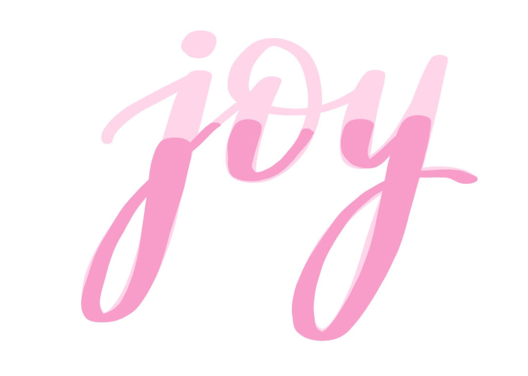
Step 3: Using the darker color, trace over the bottom portion of your lettering.
Keep in mind that when using paper and markers, your colors will blend together in the traced area (ie: dark blue over a green color will become a dark teal). If you are doing this digitally, the darker color will maintain its original shade. It’s totally up to you how much of each letter you trace with the darker color.
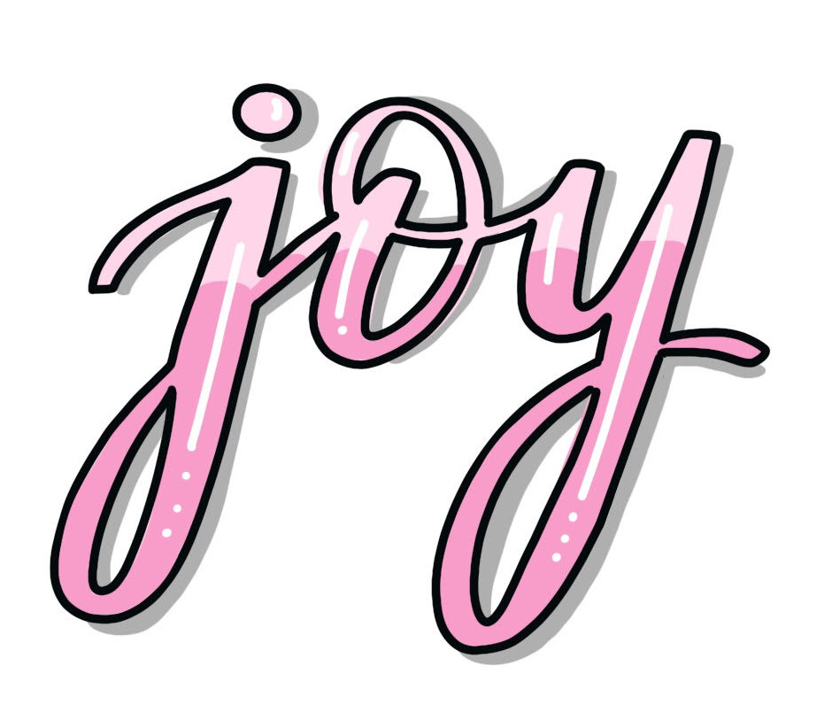
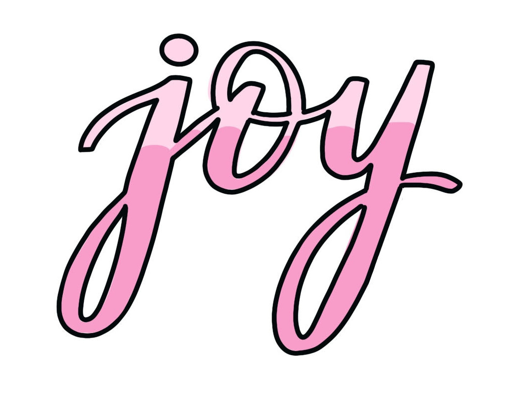
Step 4: Trace around the edges of your letters with a thin black marker.
I like to use a Tombow Mono Drawing Pen for this step. Larger sized markers (ie: 05, 04) will give you a thicker, darker outline than smaller ones (01, 02…). Play around with the different sizes and see what effect you like best!
If you like, you can stop right here and you have a fun two-tone script font. Or, you can continue on to add a few more effects; shadowing and highlights.
Step 5: Use a grey marker to add a drop shadow to the right of each letter.
To help you figure out where the shadow lines go, imagine yourself writing the word a second time, just slightly to the right and below the first one. You can even lightly pencil it in and erase it later, if you like. Then, wherever those lines would fall, you’ll want to use the grey marker.
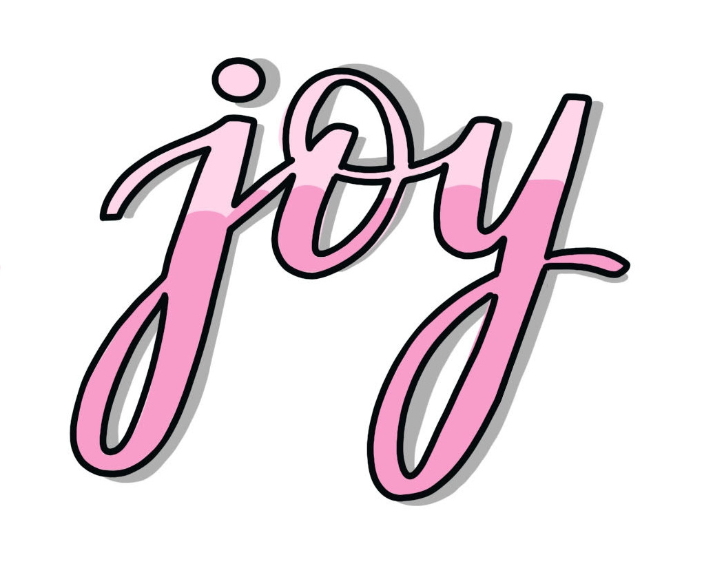
Step 6: If you like, you can add highlights to the letters using a white gel pen.
I typically do a line with one dot for shorter letters and a line with three dots for letters with long descenders or ascenders. Once again, this is an optional step; if you like your word without these lines, you can definitely keep it that way!
This technique takes longer than writing in “normal” brush script style, but I love the overall effect, don’t you? The blending of colors is so appealing, and the words seem to pop right off the page.
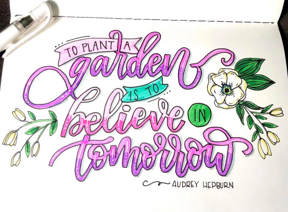
What do you think? If you give it a try, I’d love to see how yours turns out. Make sure you’re part of the Amy Latta & Friends Facebook Group so you can share your practice and project photos with us. Also, don’t forget to check out the Amy Latta Lettering Academy and sign up for the class that best matches your level of skill and experience, so that we can take your lettering to the next level together!
This is such a great Idea! I had fun trying it!