Basic Bounce Lettering
One of the things that makes modern hand lettering stand out from traditional calligraphy is that many artists add visual interest by using a style called “bounce lettering.” Whether you realize it or not, many of the lettered images you love on Pinterest and Instagram are so aesthetically appealing because of the way the letters seem to bounce around inside a word rather than being straight and even like you’d expect.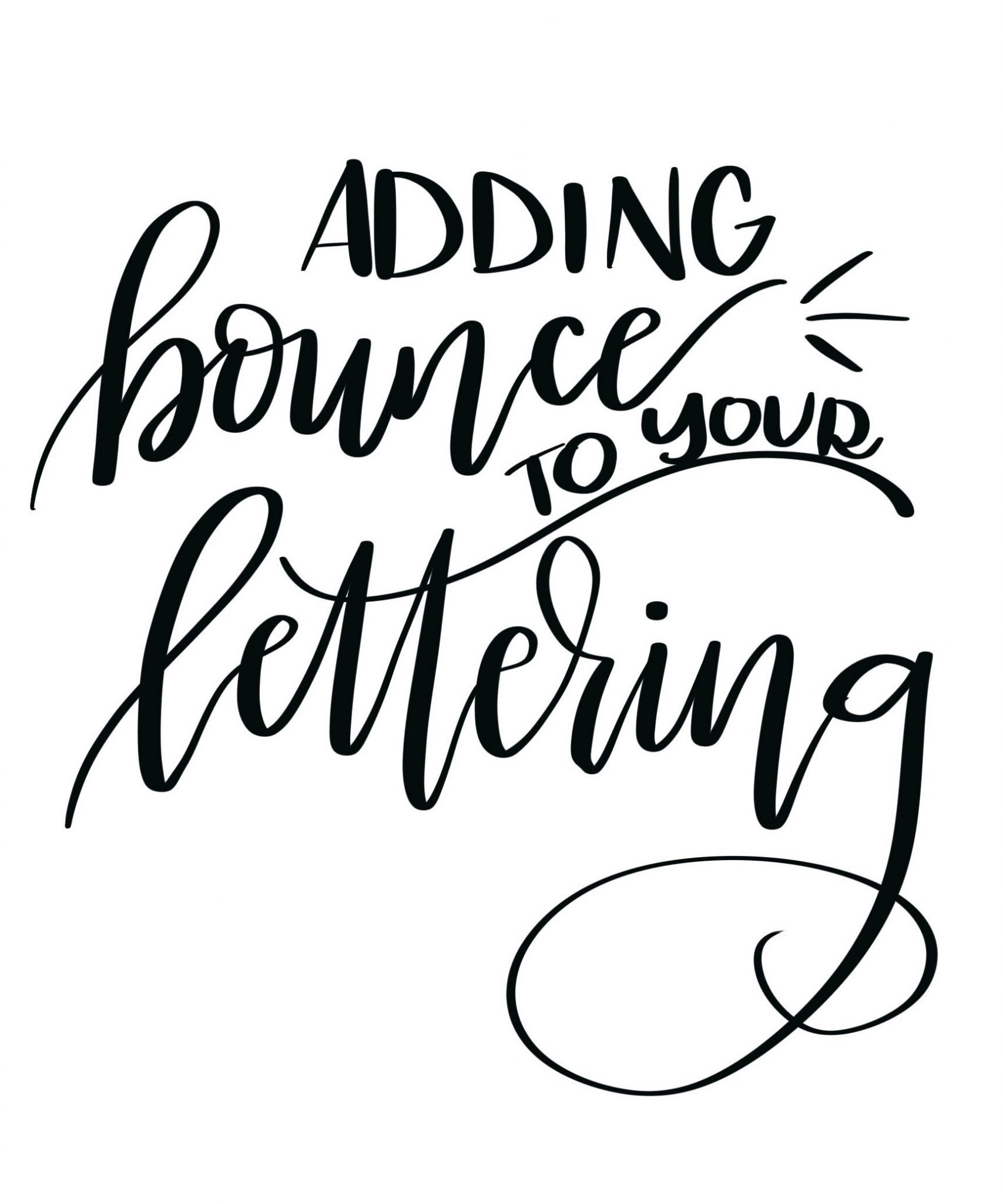
Chances are, if you’re reading this post, it’s because you want to incorporate this style into your own hand lettering. First things first, if you haven’t yet gotten the basic hang of either faux calligraphy or brush lettering, you’re going to want to start there and master the fundamentals. Then, come back here to take your lettering to the next level. If, however, you’ve got the basics down pat, it’s time to move on and see how we’re going to make those letters bounce around in your words and phrases.
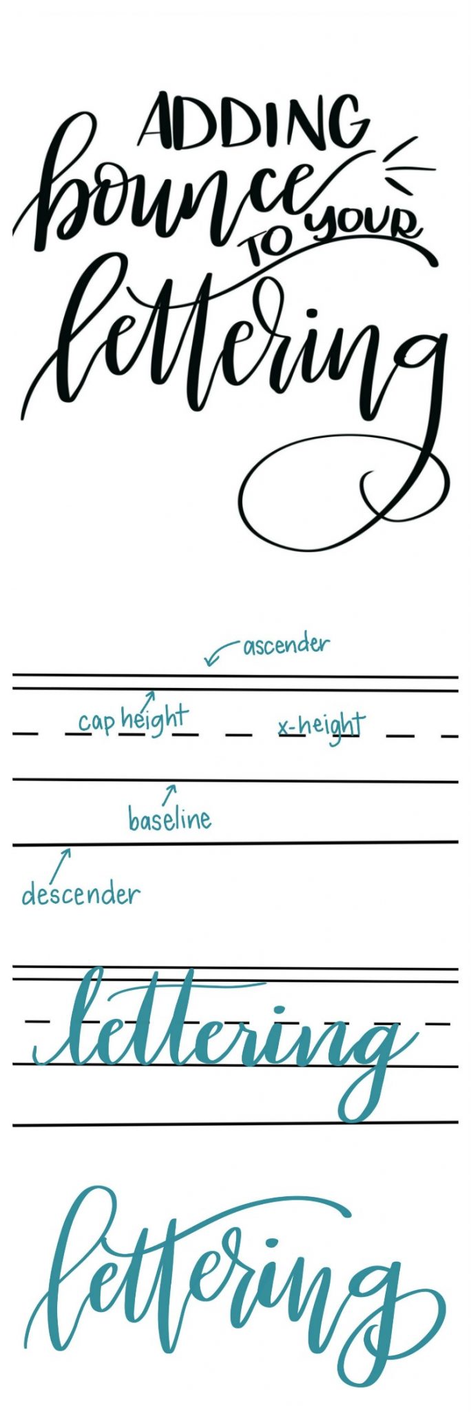
Before we can play around with our letters, we first have to look at the “rules” behind how we normally write. Whether or not you remember being taught these things, they’re ingrained in our brains when we put pen to paper. Take a look at this little diagram that represents where the various parts of a letter are supposed to go.
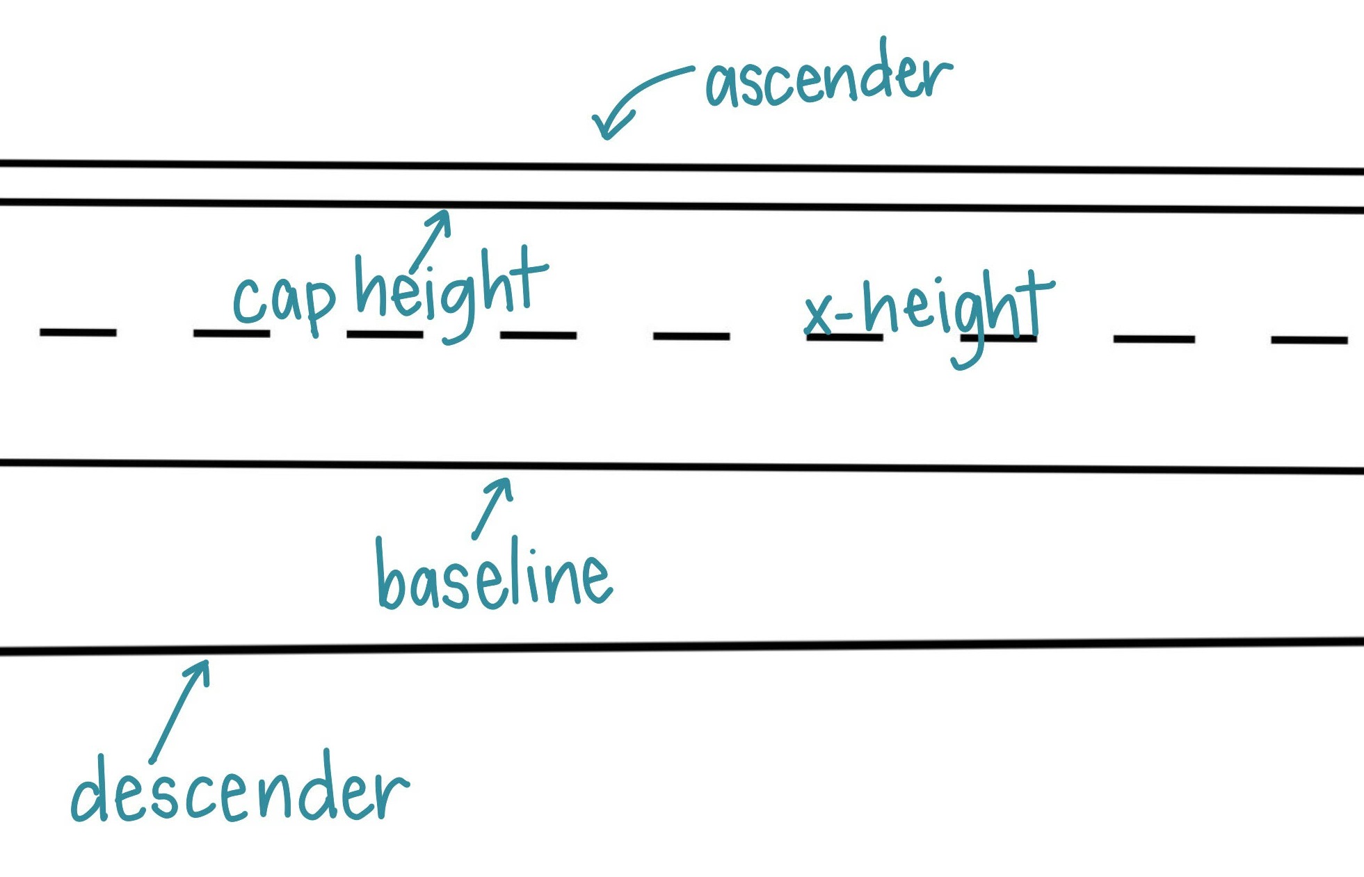
I’m sure you recognize the dashed line with a solid line above and below it; it’s what you used in grade school as well as perhaps for hand lettering practice. There are also two additional lines, one above and one below that we don’t always see marked on the paper, but that invisibly exist when we write. Here’s what it all means.
The baseline is the guideline that keeps our letters straight. The bottom of each letter we write, whether it’s capital, lowercase, cursive, or print, sits on this line {unless the letter has a descending line like j, g, q, or p}.
The cap height is the guide for how tall our capital letters should be.
The x-height, represented by our dashed line, is where the topmost point of our lowercase letters stops, unless they have ascending lines {like d, k, l, or t}.
The ascender line is the guide for where those vertical lines in d, k, l, t, and b stop. Some folks omit this line and make the ascenders the same as the cap height…either way is okay.
The descender line is the lowest point for the vertical lines in letters like j, g, q, and p.
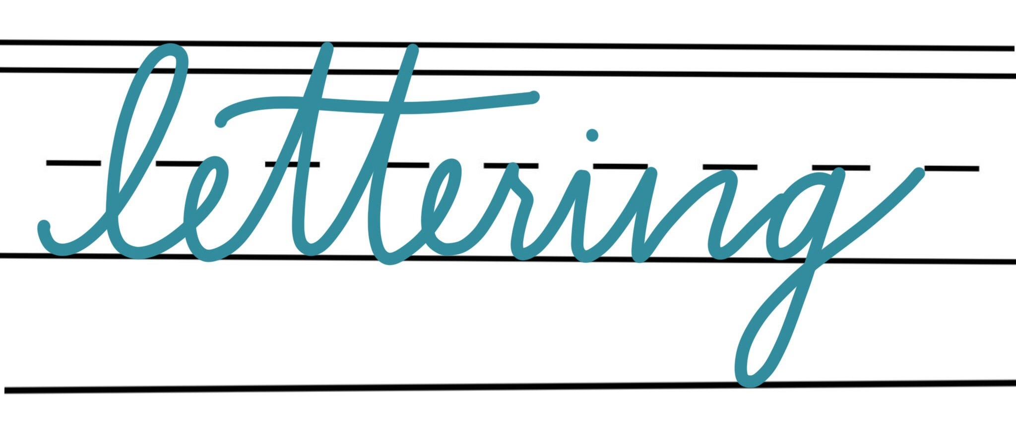
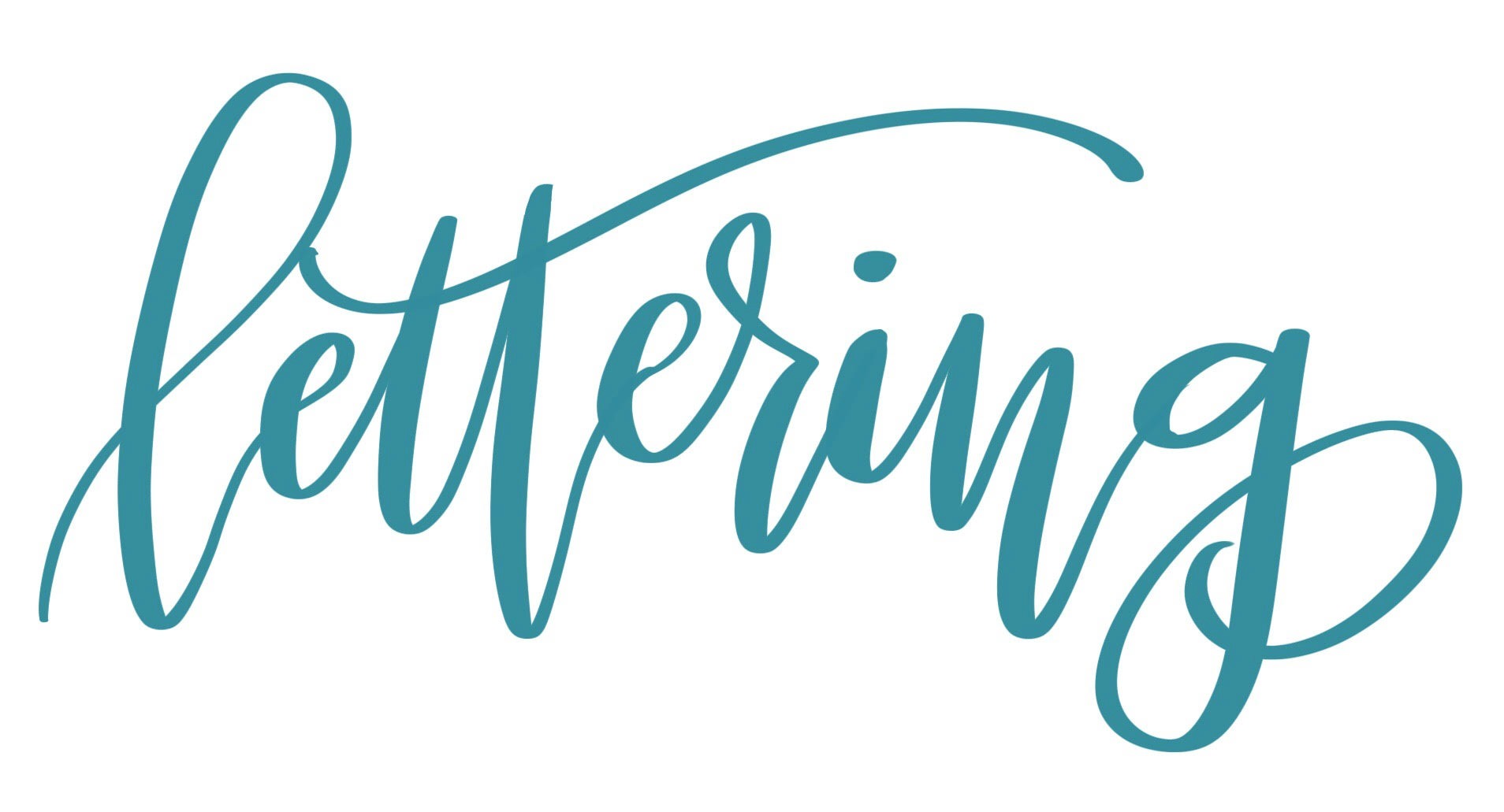
So far so good? All of these lines exist to help us keep our writing straight and even. Take a look at the example above. I’ve written “lettering” in lowercase cursive, making sure to follow the rules and keep my letters within the lines. Below is an example of how that looks when we write in the brush lettering style. It’s pretty, to be sure. But it definitely does not bounce.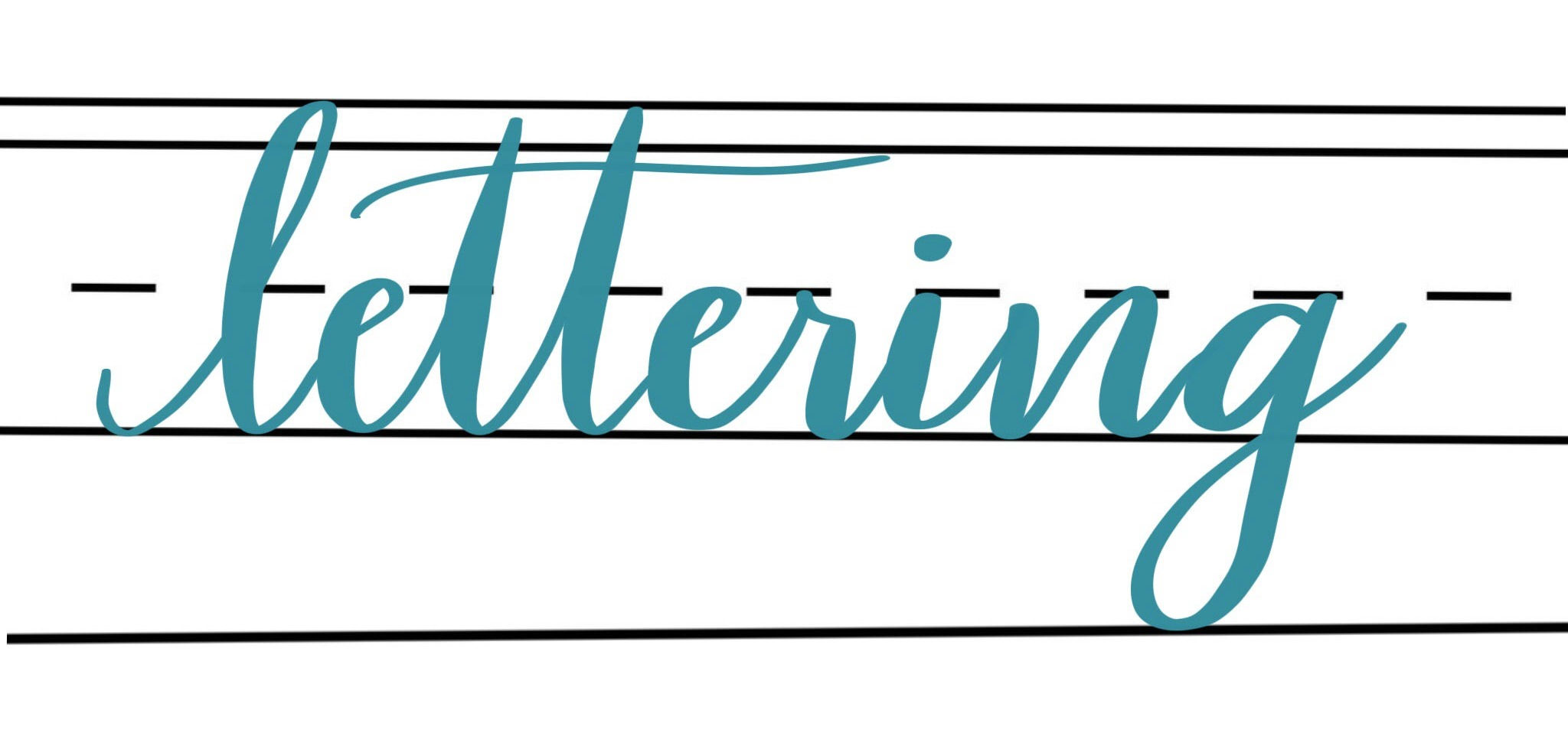
In order to get the bounce lettering effect, we essentially have to break the rules and let ourselves write outside of those guidelines we’ve been taught. We have to let our ascenders go higher, our descenders go lower, and forget about keeping a consistent baseline. Take a look.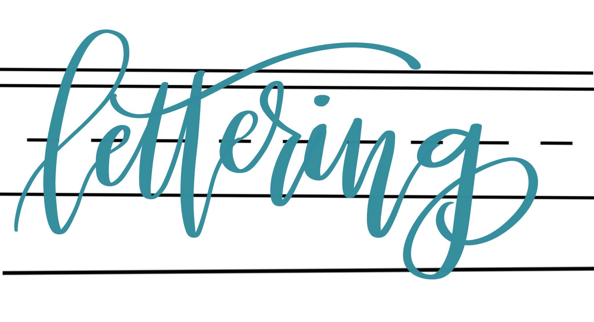
While there’s certainly nothing wrong with writing on a baseline or keeping your lettering straight and even, learning to break the rules like a pro gives you the opportunity to write in a totally different style. Here’s how my word looks when I remove the lines from the background. Isn’t it fun?!
Once you understand that the trick to bounce lettering is forgetting about the constraints for where the high and low points of your letters go, it’s a piece of cake, right? Well, not necessarily. For some artists, that’s all they need to know, and they’re off to their sketch pad to get started. If that’s you, you can stop reading now and go play with your markers or iPad Pro. But if you’re like me, you might still have an unanswered question, “HOW do I break the rules in a way that looks good?”
In other words, for me, it wasn’t enough just to know that I could write my letters anyplace I wanted. When I tried, it looked willy-nilly and strange because I didn’t have any method to my madness. Essentially, I needed rules for how to break the rules. Does that make sense? If you’re in that boat, here are a few of the ways I tend to position my letters.
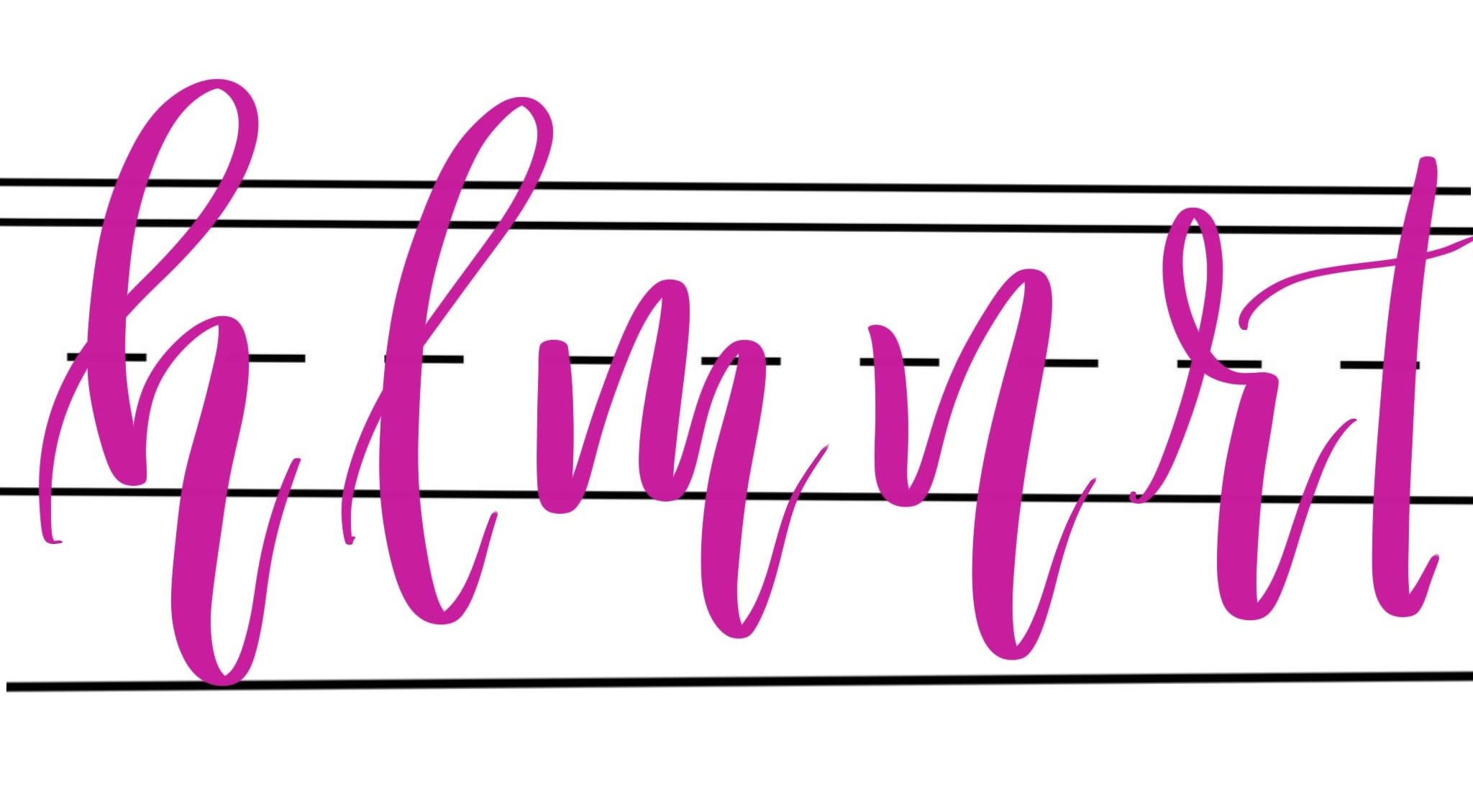
1. I’ve found that for letters that end with a downstroke, like h, l, m, n, r, and t, it feels and looks natural to extend that downstroke past the baseline before heading back up to form the next letter. These will become the lower points in your word.
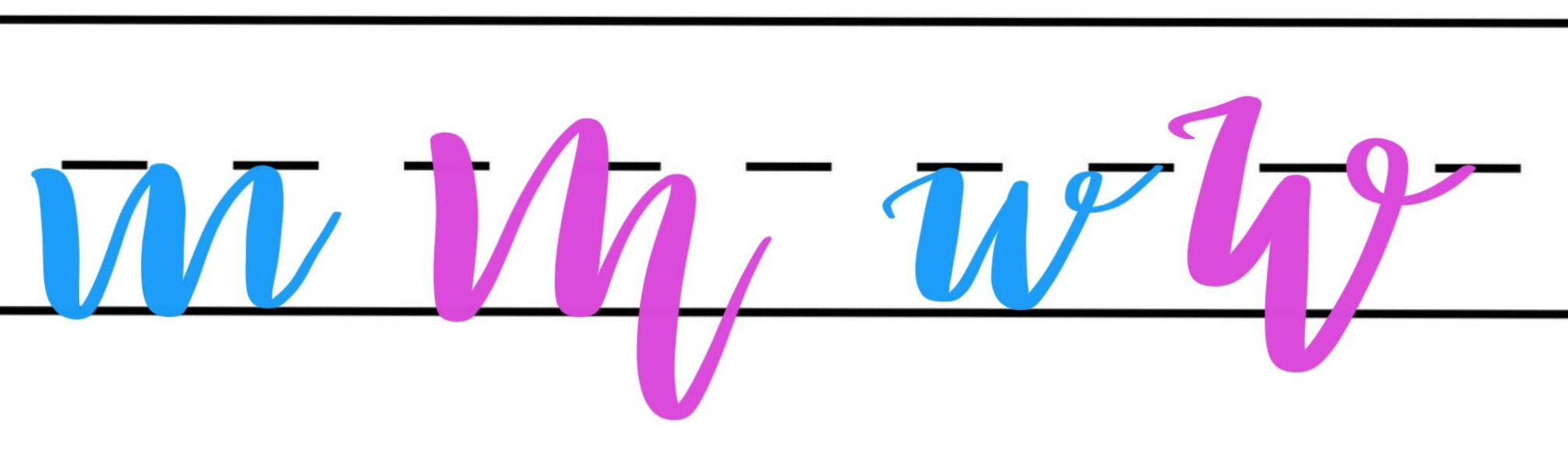
2. For letters with multiple x-height lines, vary the heights instead of making them all the same! For example, m and w take on a whole new look when written this way.
3. Balance out the rest of your word, making your remaining letters larger, higher, etc. Sometimes the best way to decide where a letter goes is by looking at what’s right next to it. Play around with different ways to write your letters that break the normal constraints for where it should go. 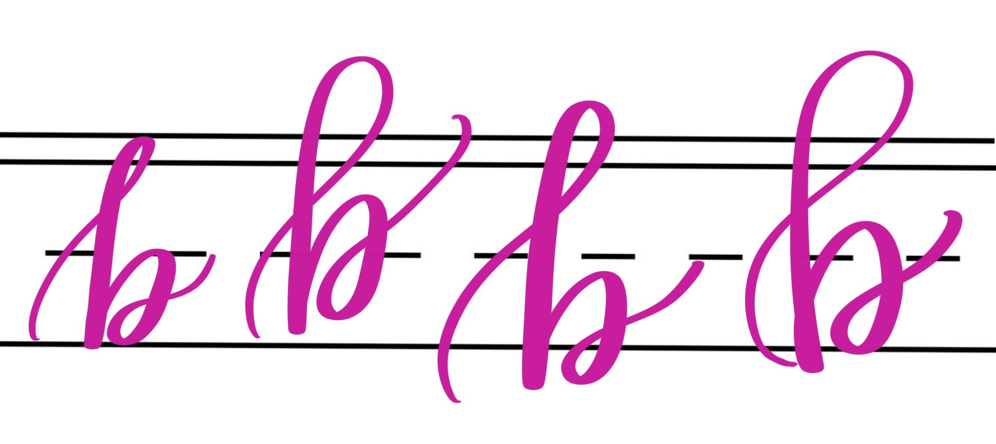
Take a look at the example below. The descending lines in “w,” “r,” and “t” are my lowest points. To balance them out, I let the “i” and “e” float a little higher. Also, I varied the heights of the “bumps” in my “w.” For extra visual interest, I made a large loop in my “r” that extends all the way to the cap line and let the crossbar of my “t” extend out and up past the ascender line.
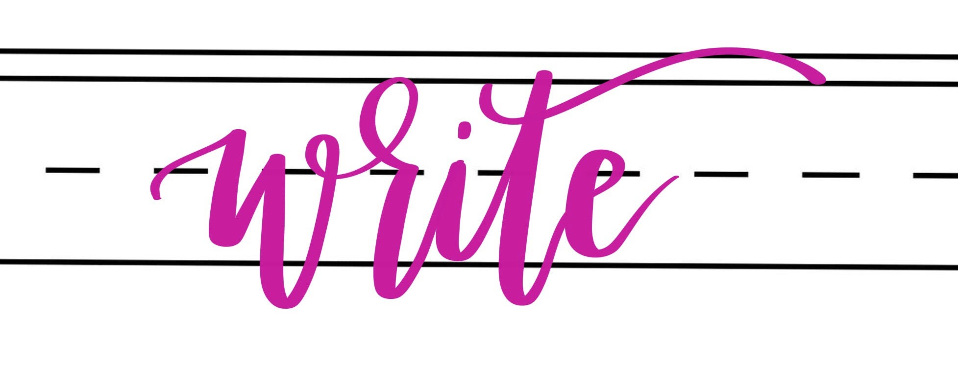
When you put all that together, you get a word with letters that seem to bounce around inside of it.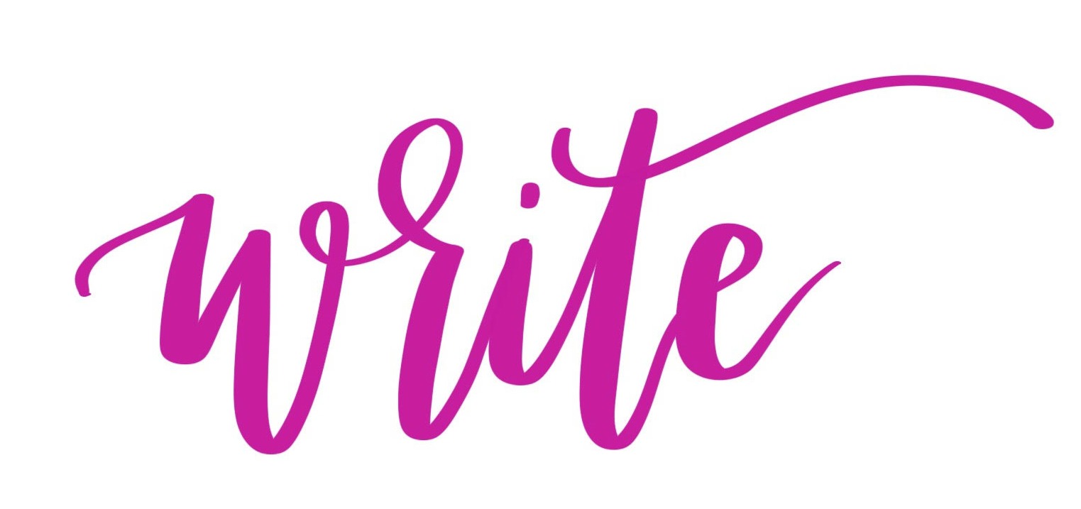
Make sense? No two artists create their bounce lettering in exactly the same way, and as funny as it seems to say, there are no absolute rules other than to break the rules. Let your marker go outside the lines!
I hope this gives you a basic understanding of how bounce lettering works, as well as some practical tips for practicing it on your own. I’d love to see your progress and some of your favorite lettered words! Feel free to share, ask questions, and more in the One Artsy Mama and Friends Facebook group! See you there. Also, be sure to check out my other Hand Lettering tutorials and free practice pages for more tips and “how-to”s that will have you lettering like a pro in no time.
Thank you so much for this! I’m so “in the lines” that I had no idea how to even start with bounce lettering. This is a great guide.
Thanks so much. Have been practicing this and your tips are perfect!
Thank you so much for this Amy! You make it so simple and easy that I may actually succeed this time! Thank you again!
I like your concept here! Been trying another calligraphers style of this type of bounce. but with oblique pen.
Great teaching, Amy! I’m going to be addictive to this! Could you also give us some “rules” on adding numbers, say to a date or address line? Thanks!
Those are some great tips! Thank you! One question though, how do you get the letter variations, like the extra swirly G in lettering? Or the new R in lettering? Or the new T cross?
Very helpful. Would love a list of good words to practice on.
Thank you for the wonderful post! I spotted this bounce lettering years back on a number of signs at Hobby Lobby and thought, “Hey, I’m creative, I can do that.” Then I tried it. Not so easy. Your rules for breaking the rules are really helpful. I’m hoping the next attempt will be much more aesthetically pleasing.
Lol, that sounds like my first attempts at bounce lettering too! I’m glad you’re finding the tutorial helpful!
Thank you Amy! I have read a number v of ways to bounce but your explanation makes most sense. You give some rules but not too many to be over whelming! I received your beautiful book this week and I LOVE it!
Thank you!!!!
You’re very welcome! I’m so glad you found the tutorial helpful and I’m thrilled you’re enjoying the book! Happy lettering! xo
This is sooooo helpful! Do you have any practice sheets for bounce lettering?
Thanks!
No, I should make some!
That would be great! I’m learning a lot from your site. Thanks for making it easy to understand and free! 🙂
What a great tutorial! Suddenly it all makes so much more sense, haha! Thanks!
Thank you! I’m so glad you found it helpful!
Great article! Thank you.
Muito bom esse tutorial comprei o livro caligrafia para relaxar e senti falta de tecnica tão linda. Explicação muito objetiva e prática da Amy