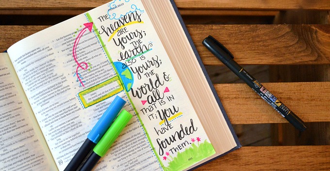
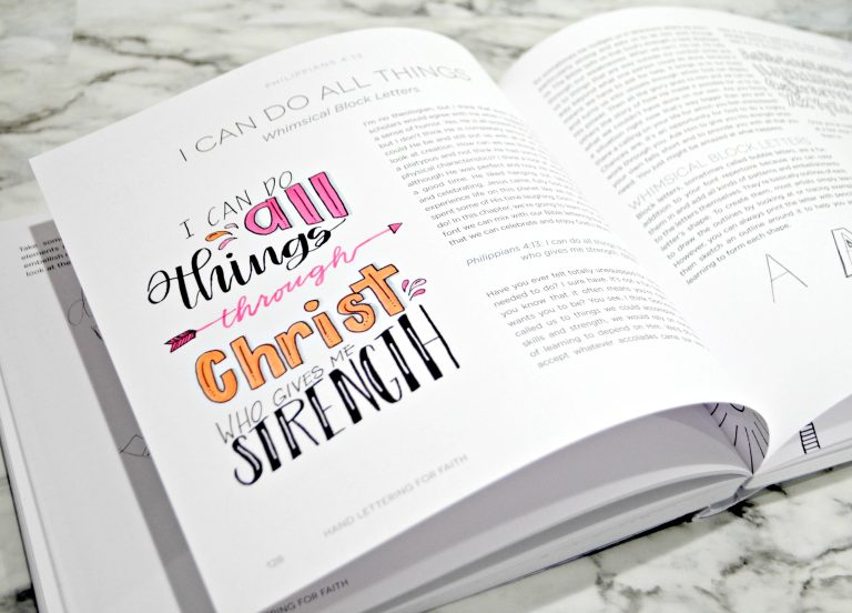
Free Hand Lettering Practice Sheets: S
Friends, today we’re continuing our month-long exploration of the Brush Script alphabet by looking at several versions of the Brush Script S. This is one of my favorite letters to write, and I hope it will be fun for you too!
If you’re new to brush lettering, you’ll want to start with the first post in the series and learn the basic brush strokes and technique. Otherwise, let’s dive in and look at the letter “S” together!

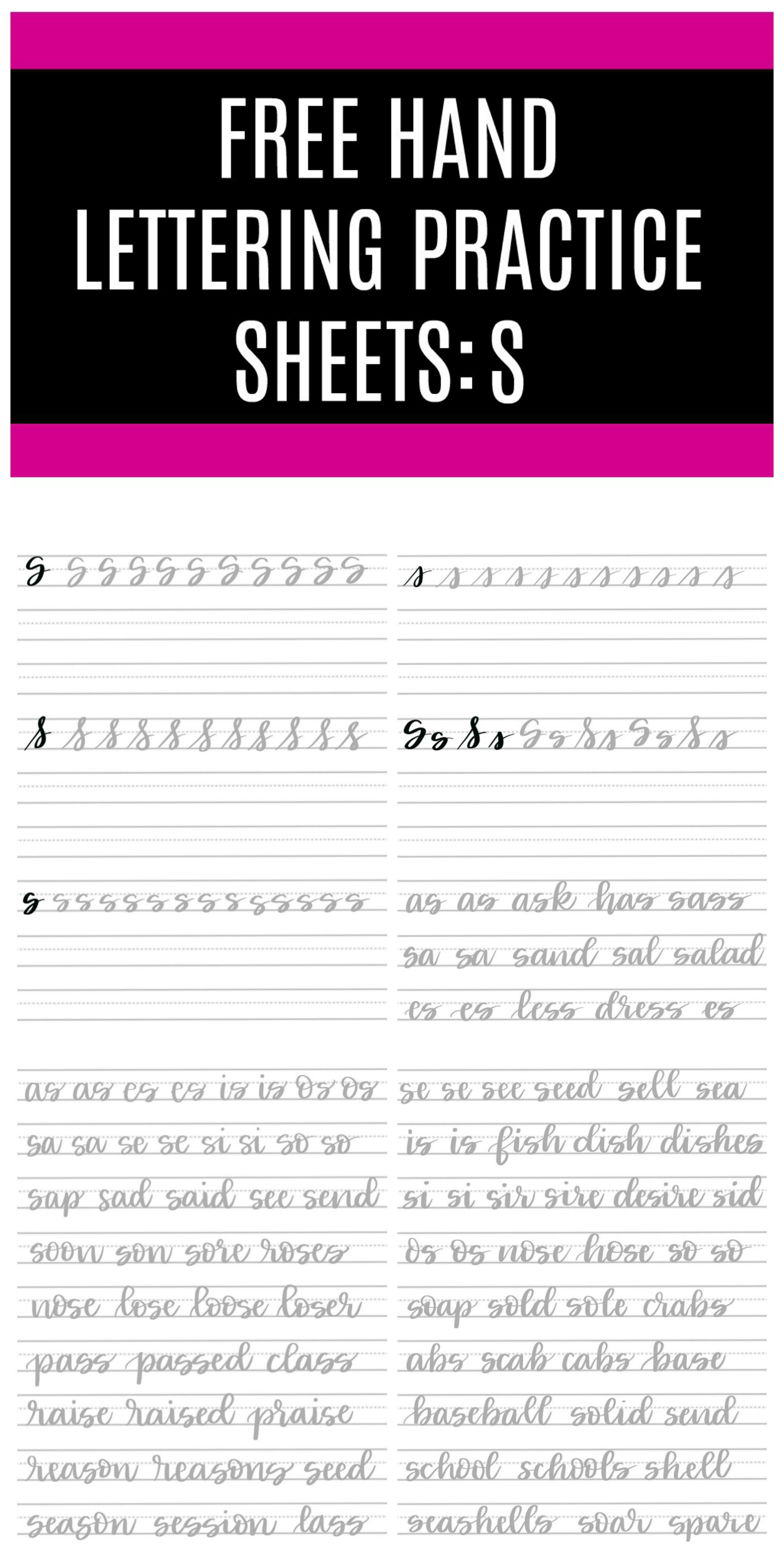
Drawing a Capital Brush Script S
The capital S I like to use in my lettering actually resembles the shape of the print letter more than the traditional cursive one. I find it easier to read and prefer the visual effect it has. To form it, we simply have to combine two very familiar shapes. The first is the letter “C” we learned many posts ago. It’s almost an oval, but stops short of reconnecting to the starting point. From there, we form an overturn with a loop exactly like what we did for our lowercase “b” and “p.” Put them together and we form the letter S.

If you prefer a letter that looks more like the traditional cursive S, here’s how to do it in brush technique. We start with a simple loop, just as we did for “b, h, l,” and other letters we’ve learned already. The second step is to form the bottom part of the shape, which is a downstroke that ends by curling up and crossing over itself, just like our lowercase letter “j.” Neither style of capital S is wrong, it’s up to you as the artist to choose your favorite one for your project.

Drawing a Lowercase Brush Script S
A lowercase s is formed exactly like its capital counterpart, just on a smaller scale. An almost-oval starts us off near the s-height line, then an overturn with a small loop finishes off our letter.

Personally, I find things much easier to read when they’re written with this more print-style “s.” However, if you prefer the look of a cursive lowercase “s” for your lettering, here’s how to create it using brush technique. The beginning is just a diagonal upstroke, and the rest is a curving downstroke with a loop, just like our lowercase “j” only smaller! When you connect those two pieces, you get a lowercase “s.”

However you decide to form the letter “S” in your own work, here are some practice pages to help you master the strokes. They’ll walk you through each version of the letter with plenty of space to practice, then give you a chance to try connecting the “s” with the other letters we’ve learned. To use them, just click the link below and download them to your device. Then, print them out or upload them to your favorite digital lettering app. You are welcome to use them as often as you like for personal practice.
Download the free practice pages here

PS. Don’t miss the rest of the series!
Practice: A Practice: B Practice: C
Practice: D Practice: E Practice: F
Practice: G Practice: H Practice: I
Practice: J Practice: K Practice: L
Practice: M Practice: N Practice: O
Practice: P Practice: Q Practice: R
Practice: S Practice: T Practice: U
Practice: V Practice: W Practice: X
As you practice, I’d love to see your progress. Share your photos in our Amy Latta & Friends Facebook group or on Instagram. And don’t forget to Pin this post for future reference as well as to share it with your lettering friends!