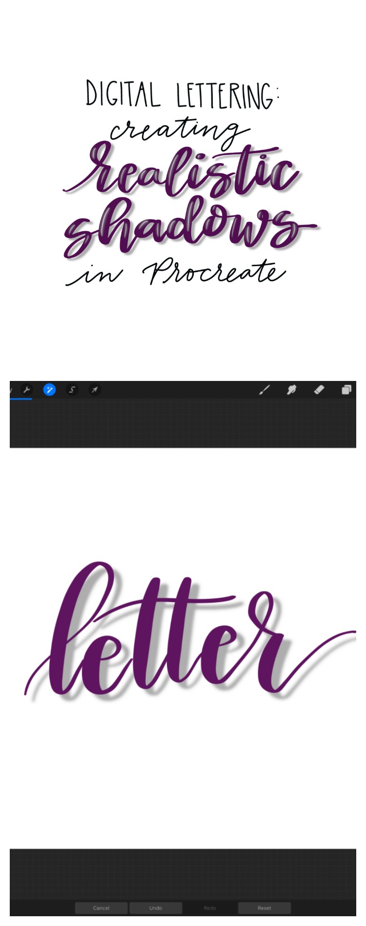
Digital Lettering: Creating Realistic Shadows in Procreate
When it comes to hand lettering, there’s a world of different options. You can create with all kinds of different types of markers on paper and other physical media, or you can create digital designs. Tools like the iPad Pro and Apple Pencil along with the app Procreate allow lettering artists to create, edit, and share designs quickly and in a digital format. Digital lettering also allows us to achieve certain effects that are difficult or impossible to create using traditional supplies. For example, we can create a shadow effect that truly looks like a shadow…semi-transparent, blurry, and exactly the same shape as the original shape. Here’s a step by step guide for creating realistic shadows using Procreate. Take a look…
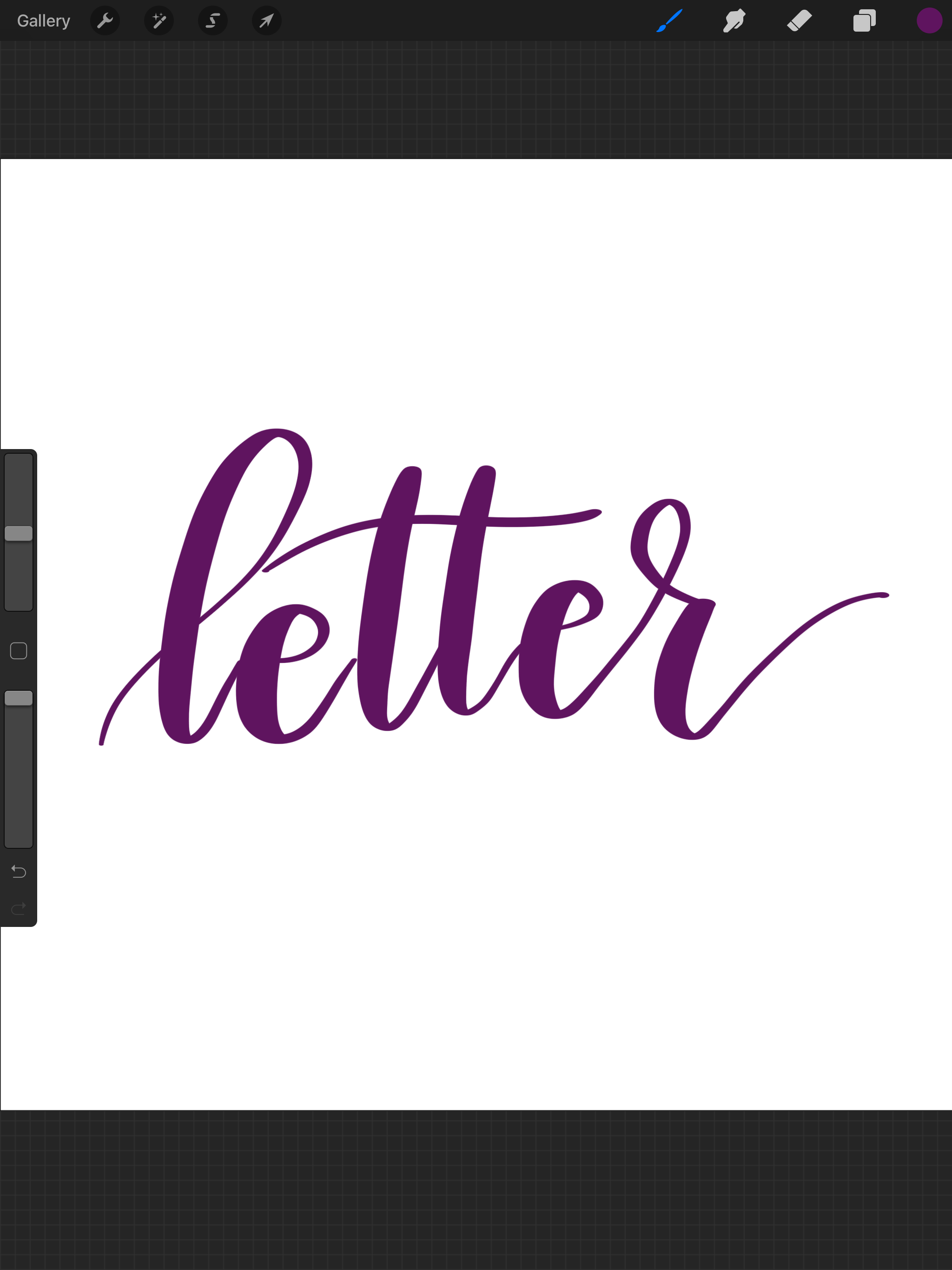
STEP 1: Open a new canvas. Choose your favorite lettering brush and write your word.
I use a custom-created brush, which I posted about here.
STEP 2: Use the “select” tool and circle the word you want to shadow.
You should see a dashed line appear around the word to indicate your selection.
STEP 3: Duplicate.
Once you make your selection and the dashed line is present, a row of options will appear at the bottom of the screen. Choose the one that says, “duplicate.”
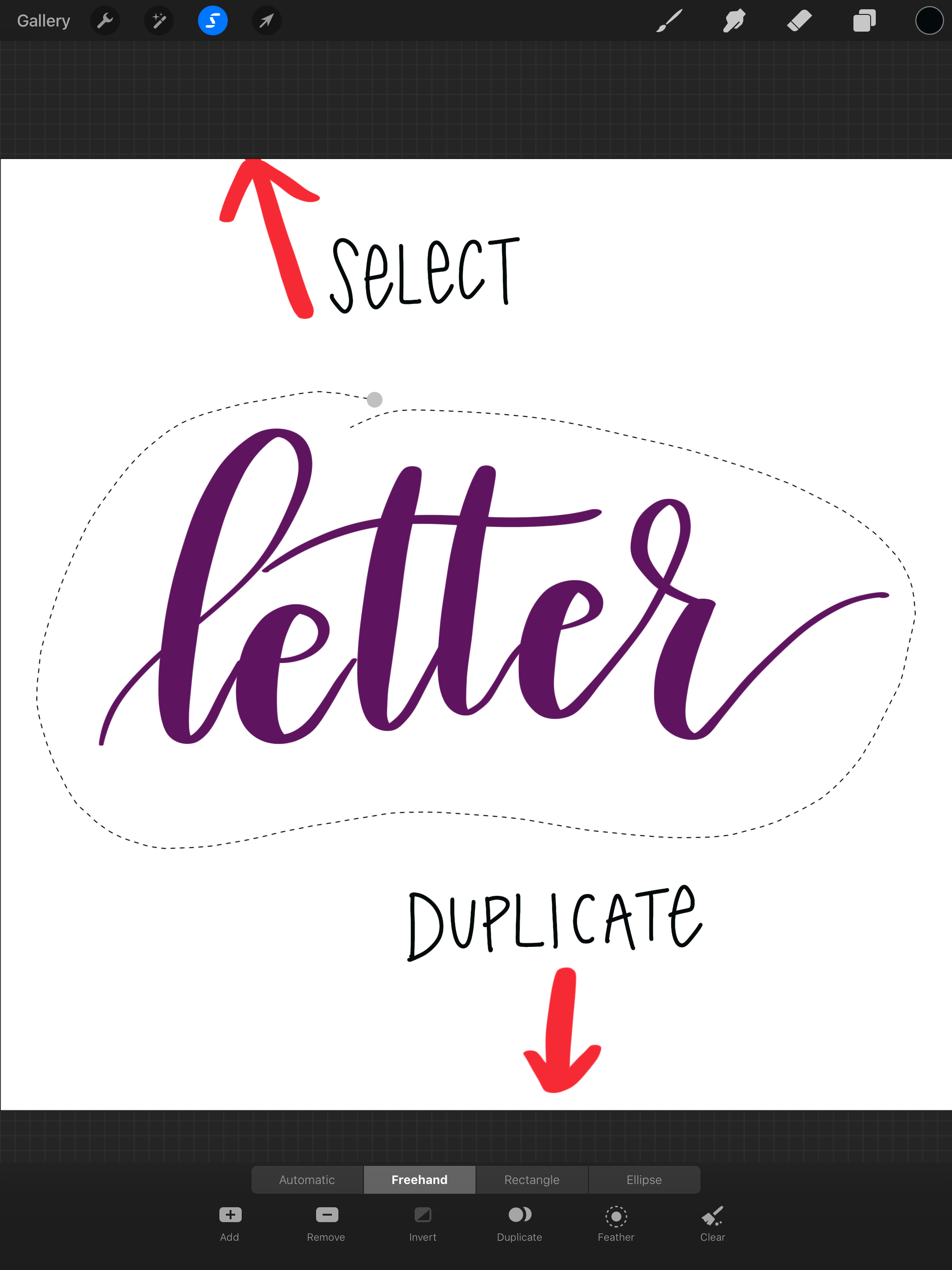
At this point, Procreate will make an exact copy of your word/shape in a brand new layer. This layer will be on top, so you’ll automatically be working with it when you perform your next action.
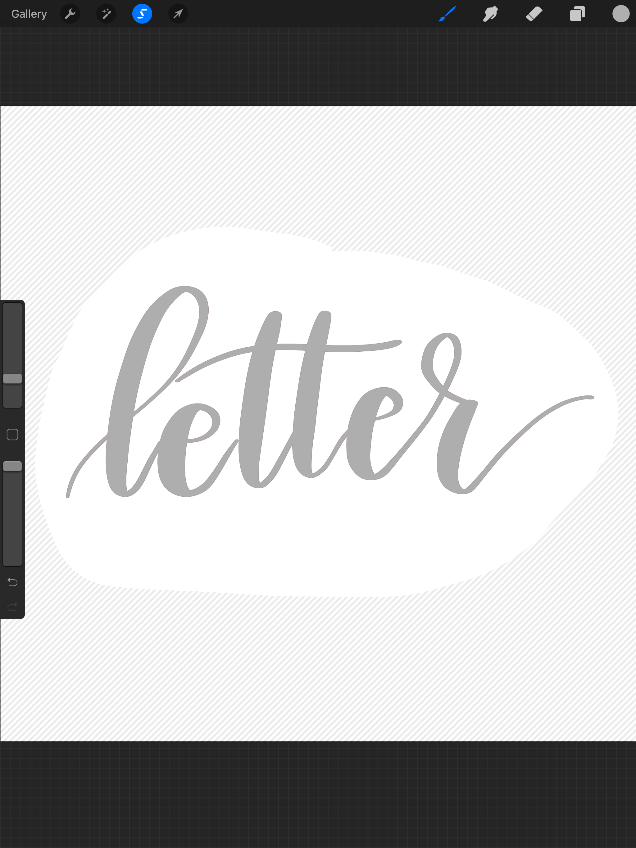
STEP 3: Choose your shadow color.
To do this, click the colored circle in the top right hand corner, which will take you to your color palette. I like to use a medium gray, but you can use black, dark gray, or anything else you like.
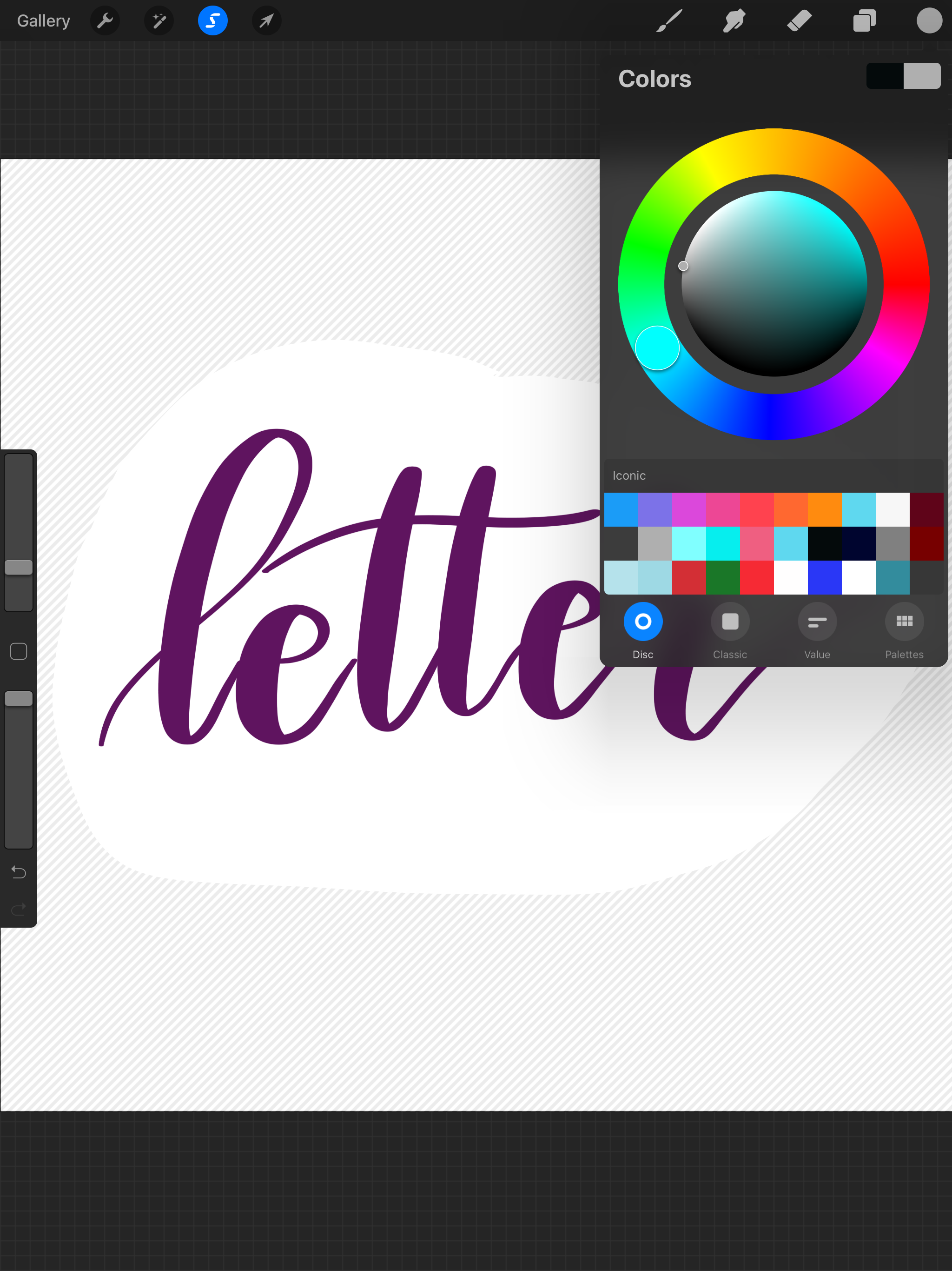
Once you make your selection, the circle in the top right corner should appear the color you want. Use your Apple Pencil to drag from the circle directly to your word. This will fill the word with the new color, as shown below. If your word is in print rather than script, you will need to drag the color to each individual letter.
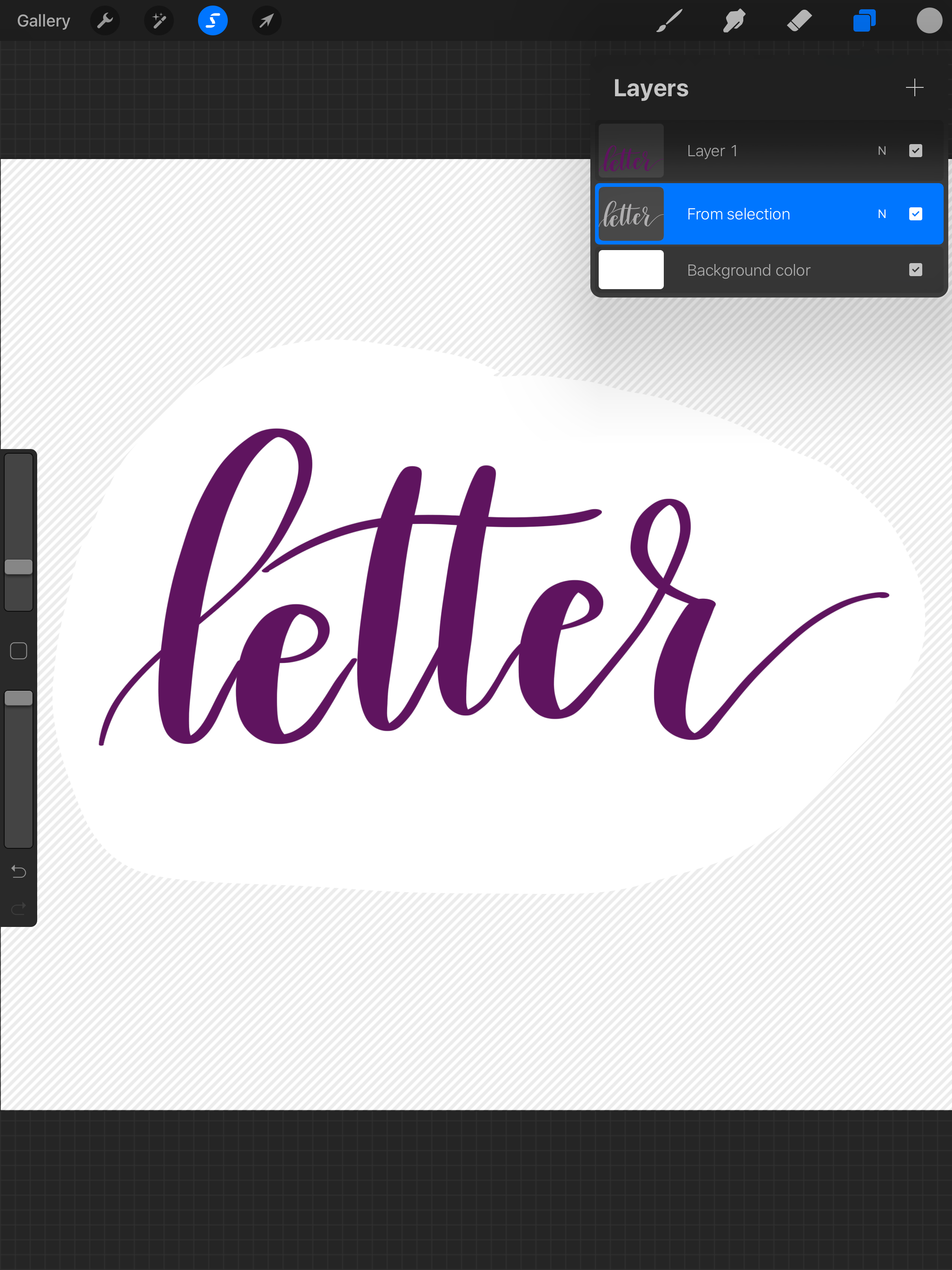
STEP 4: Place the shadow layer below the original layer.
To do this, choose the “layer” icon in the upper right menu. Your layers will appear from top to bottom. Grab the shadow layer and drag it with your pencil until it moves to a position below the layer containing your lettered word.
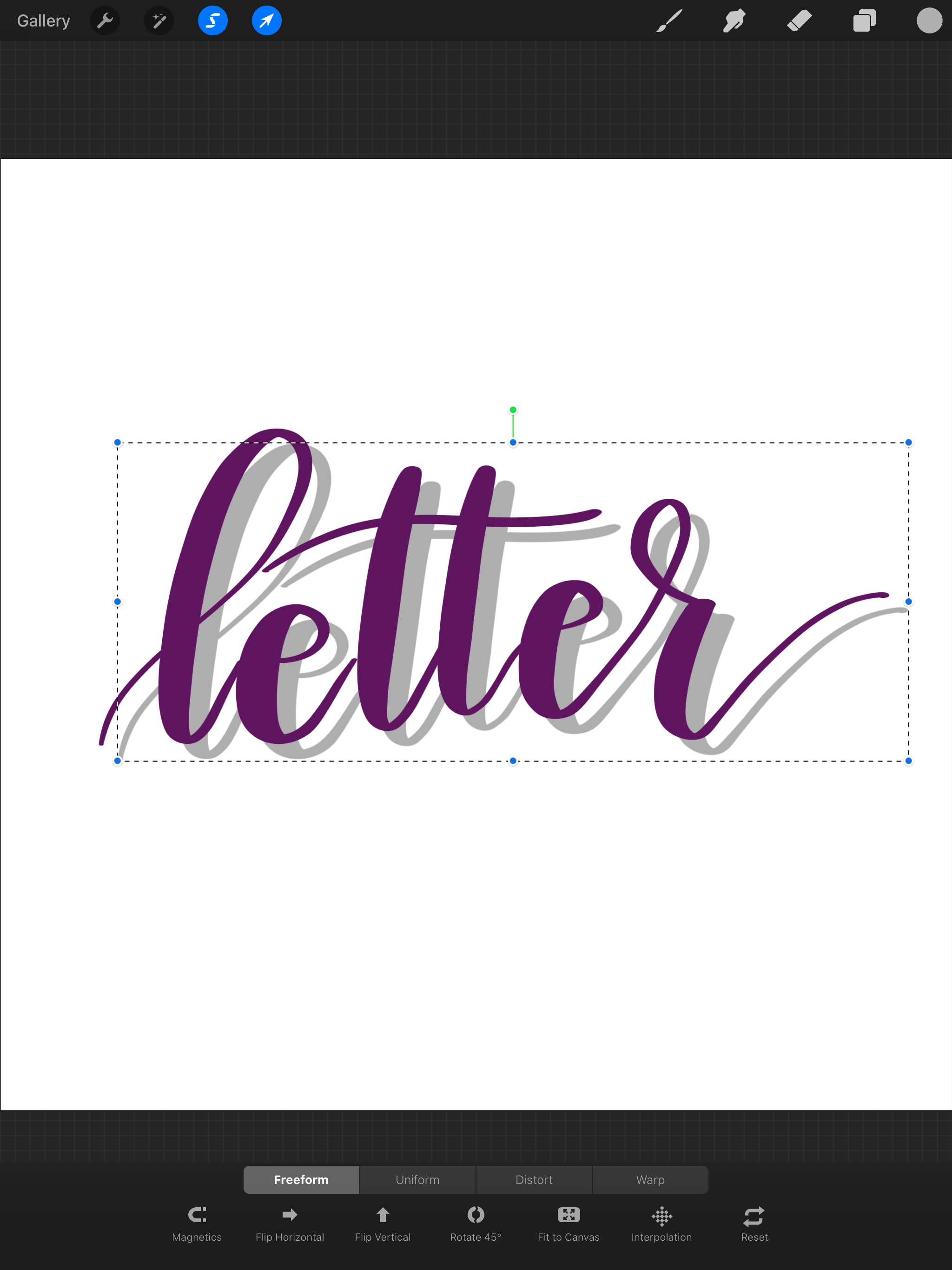
Step 5: Make sure the shadow layer is selected. Tap the arrow icon, then use your pencil to gently drag the shadow to any position you want.
I typically bring mine down and to the right, as though the light source were in the upper left corner. You can offset the shadow from the original as much or as little as you like.
Some folks stop at this point, which does give a shadow effect. However, Procreate gives us the tools to make it look even more realistic and “shadow-y.”
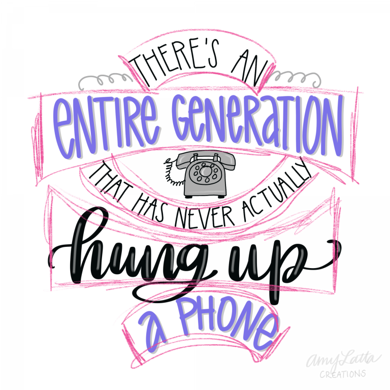
STEP 6: Tap the “Adjustments” Icon (looks like a wand) and select Gaussian Blur.
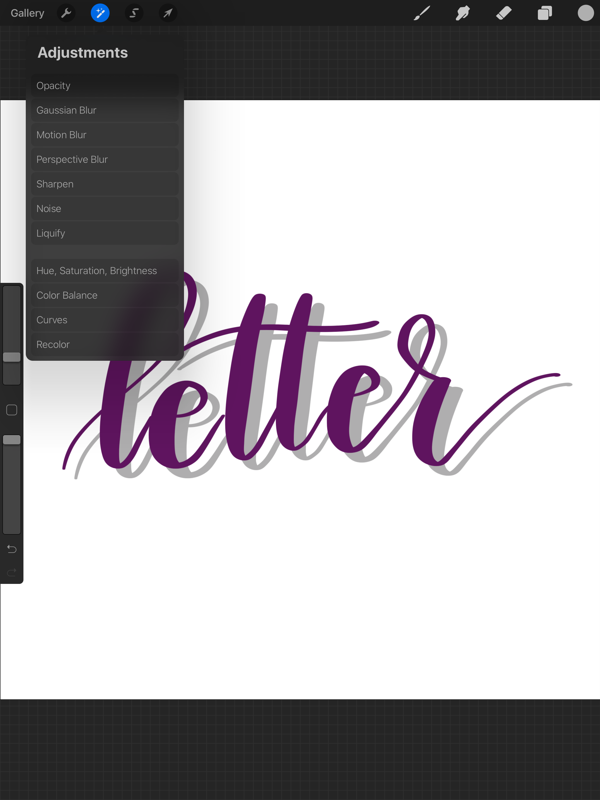
Gently slide your pencil from left to right to adjust the amount of blur until you like the effect.
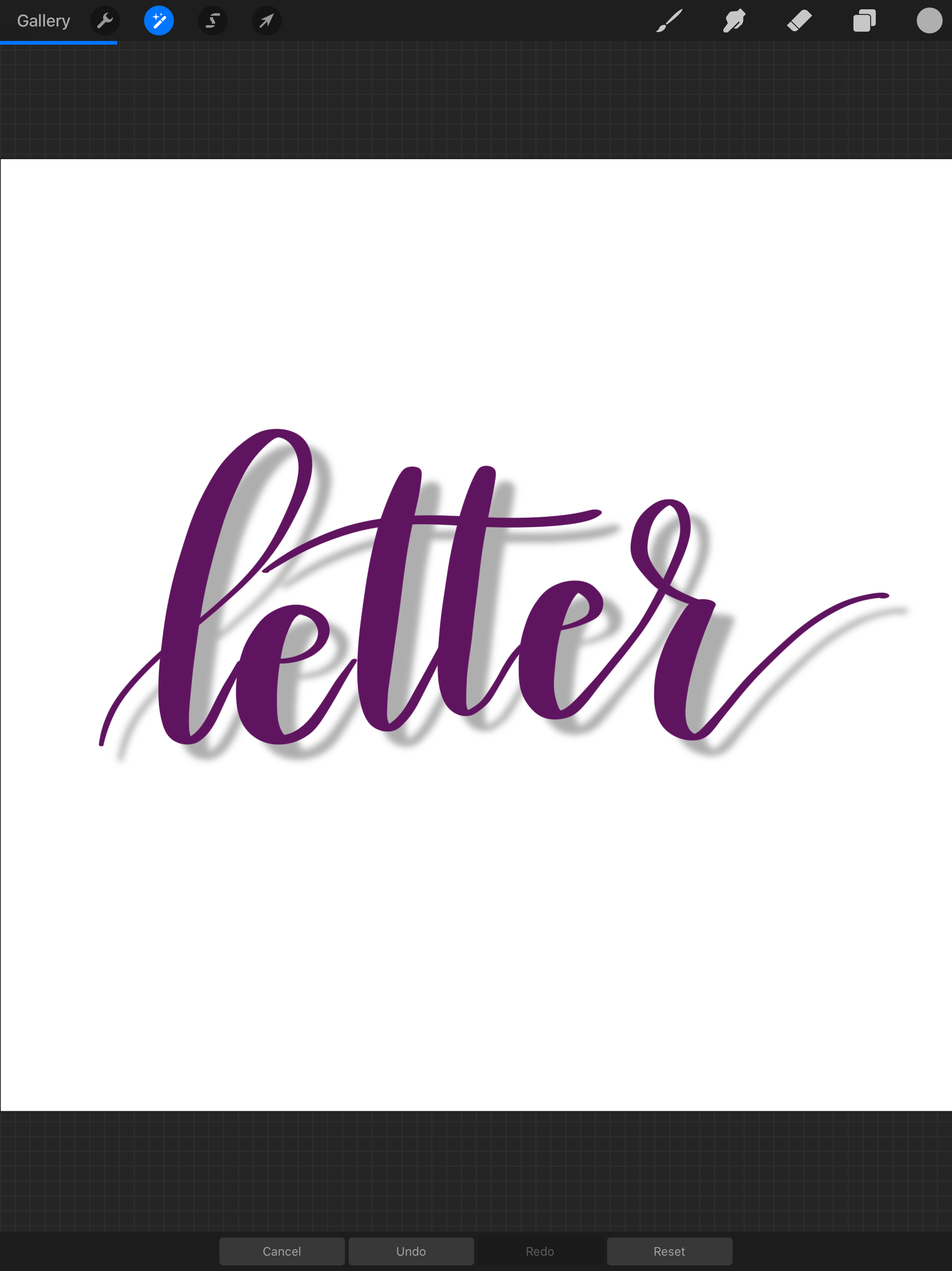
That’s all there is to it! Now you have a fun, realistic looking shadow for your word or shape.
Check out these other hand lettering tutorials for both paper and digital media. And, don’t forget to pin this one for later or to share with a friend!