Hand Lettering: Sample Thumbnail Sketches
One of the hardest things about hand lettering is figuring out how to lay out an interesting design for the quote or phrase you want to letter. The most helpful tip I’ve learned is to combine a variety of shapes and create a thumbnail sketch (also called a design grid) of the overall shape you want your lettering to take.
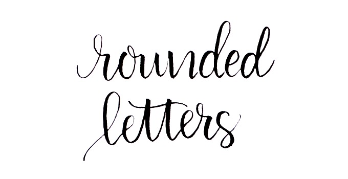
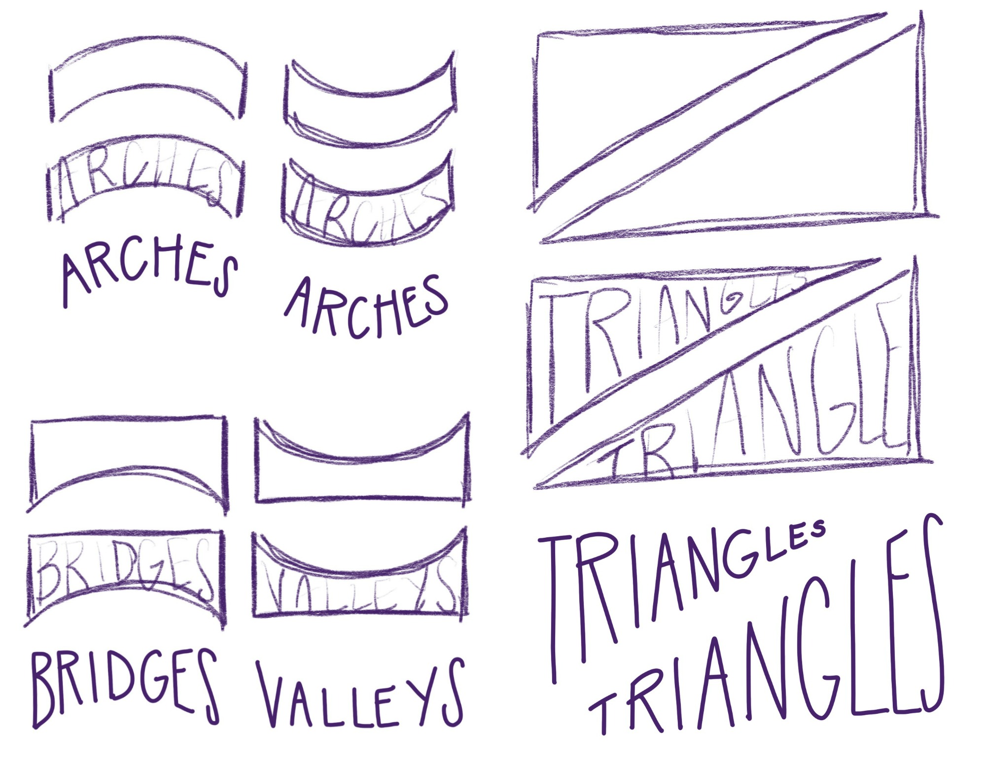
In a recent post, we looked a few of the common shapes that help add dimension and depth to lettered phrases: arches, bridges, valleys, and triangles. In case you missed it, here’s a quick review.
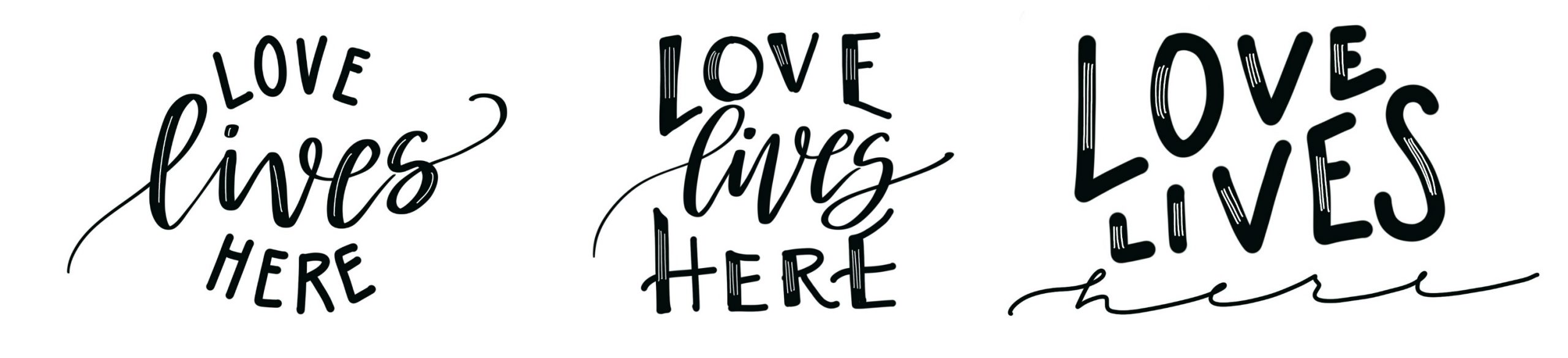
Once we learn to form our words to those shapes, the trick is in putting them all together to form a cohesive overall design. We practiced doing this with a short phrase and got results like these:
But what about when you want to letter something a little longer? Today, I have two practice grids for you that make use of these shapes you’ve already learned. I’ll show you how I used them to create some lettered designs, then you can recreate them in your own sketchbook. You can practice lettering the same quotes I did, or you can try plugging in your own words and phrases to see what you can create! Ready?
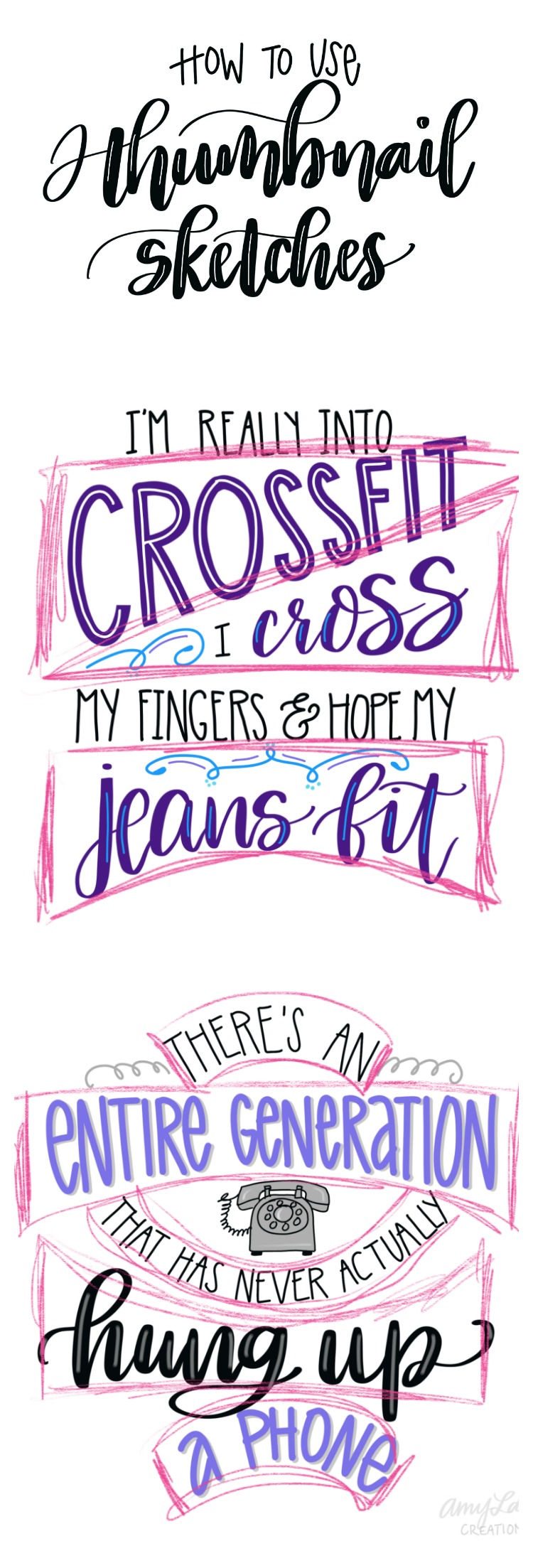
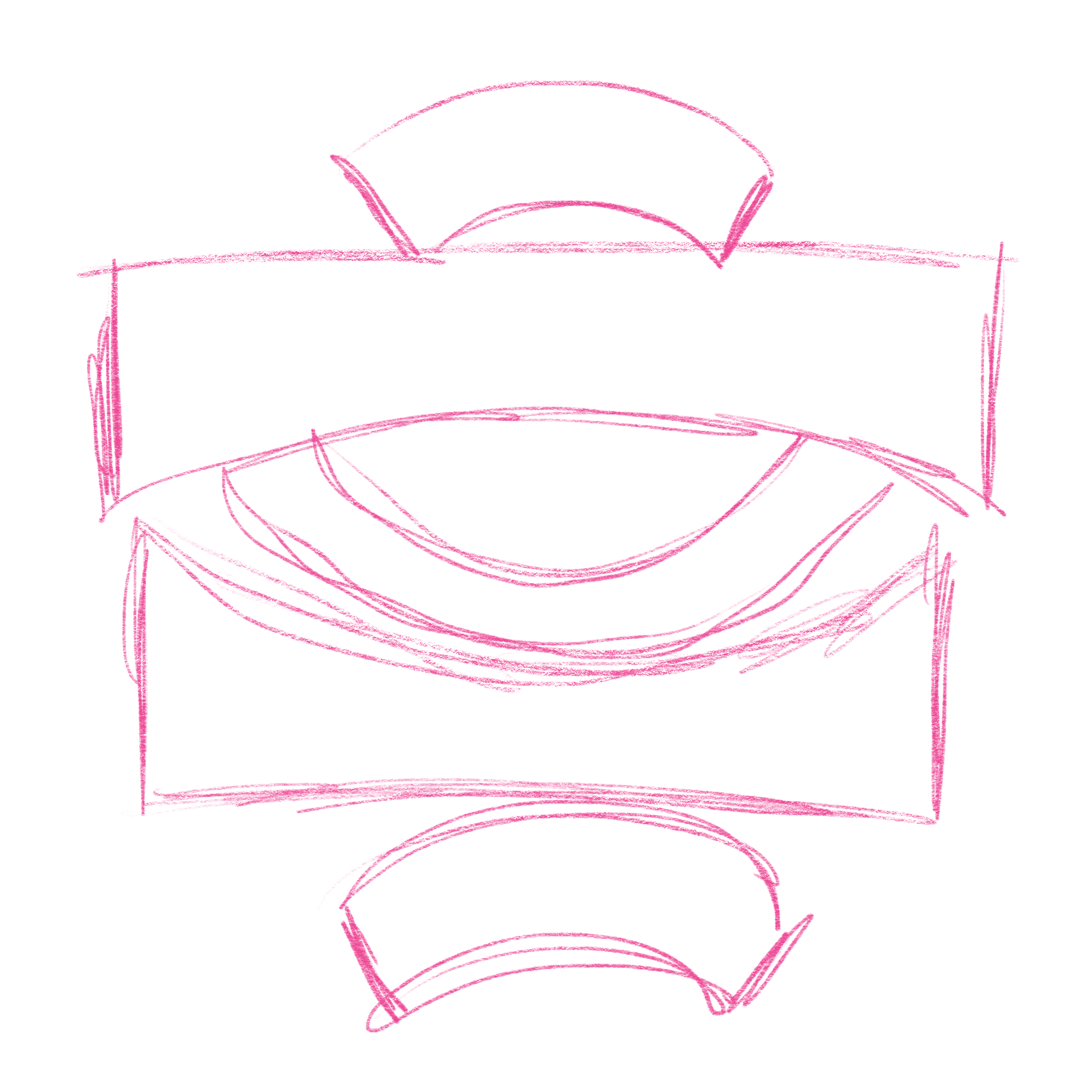
PRACTICE GRID #1
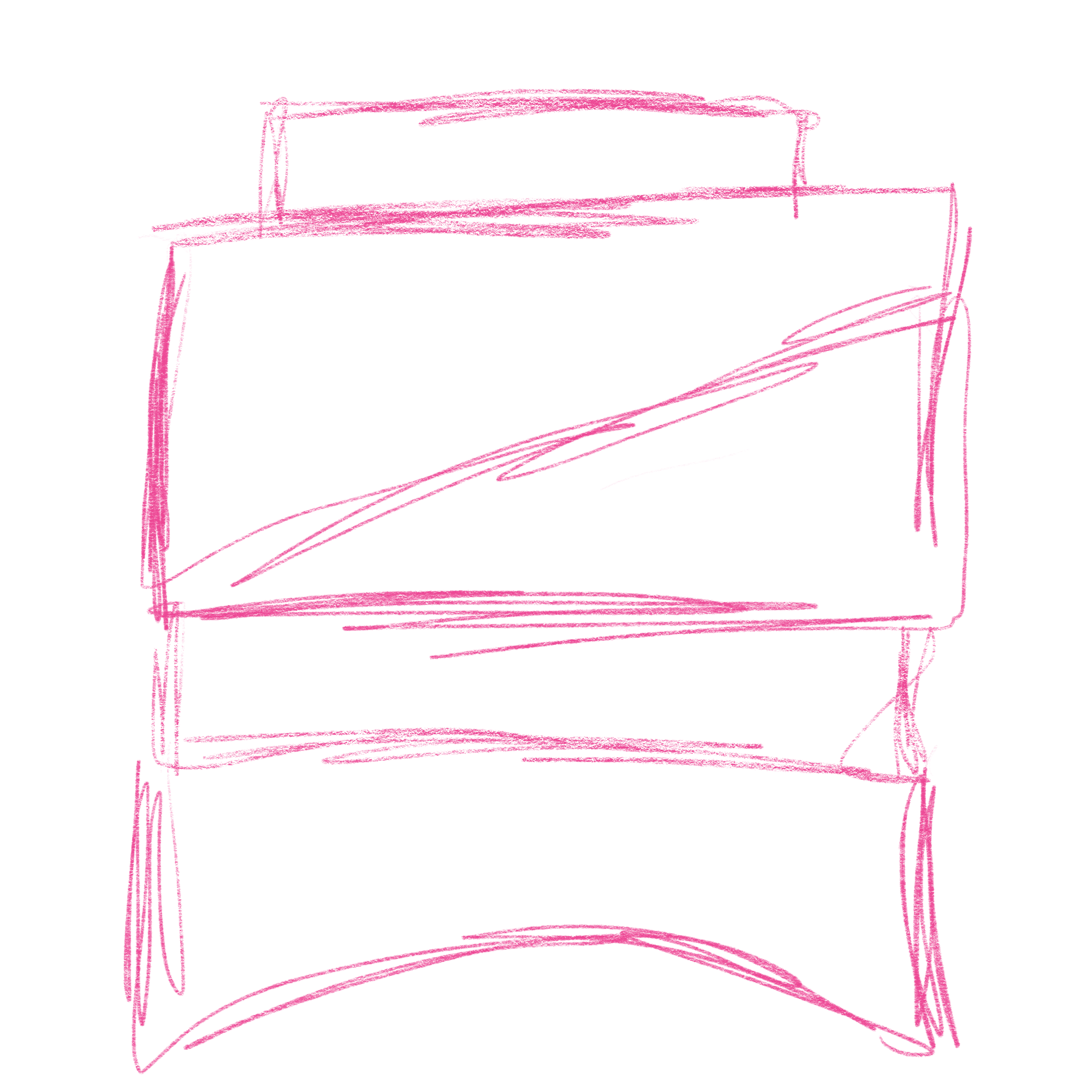
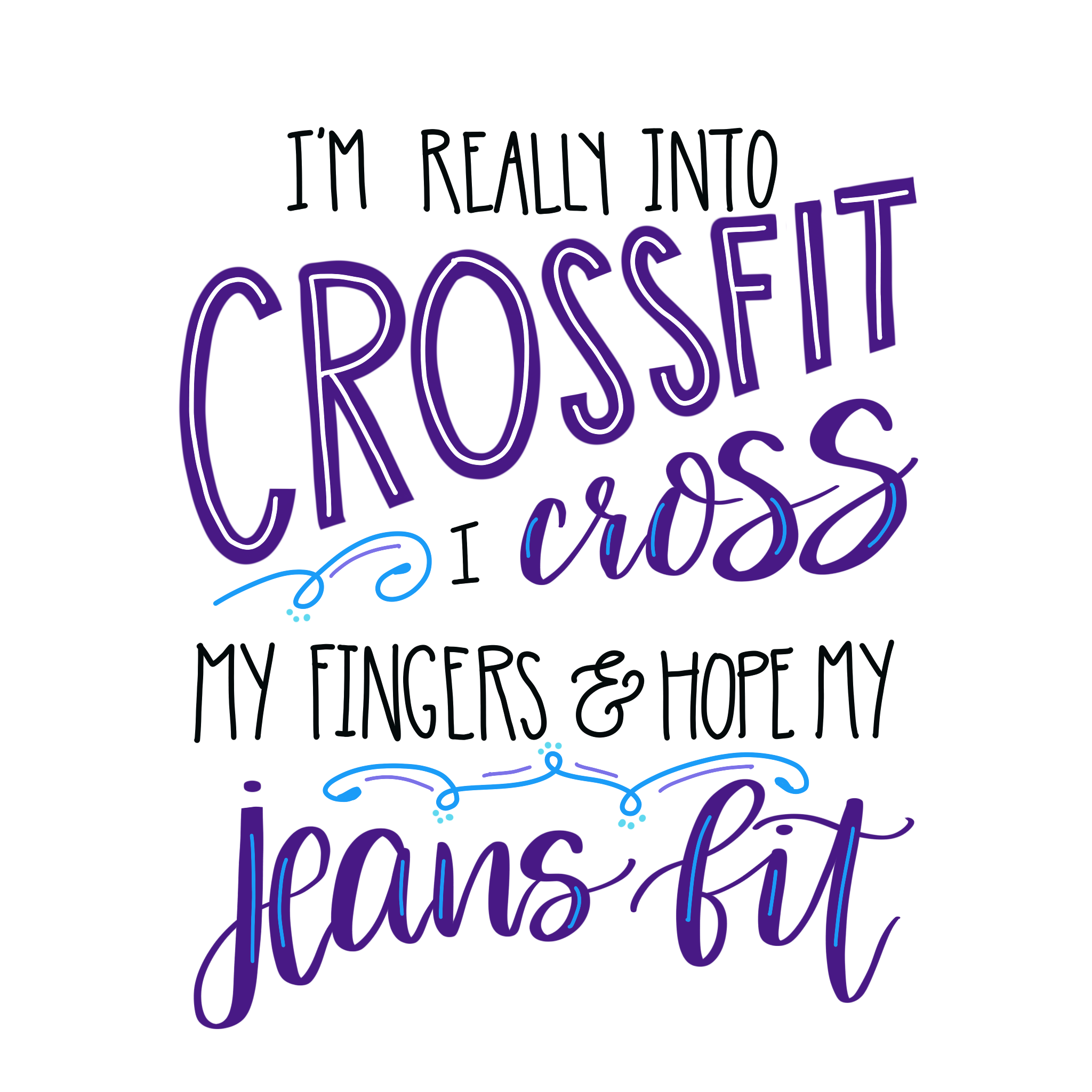
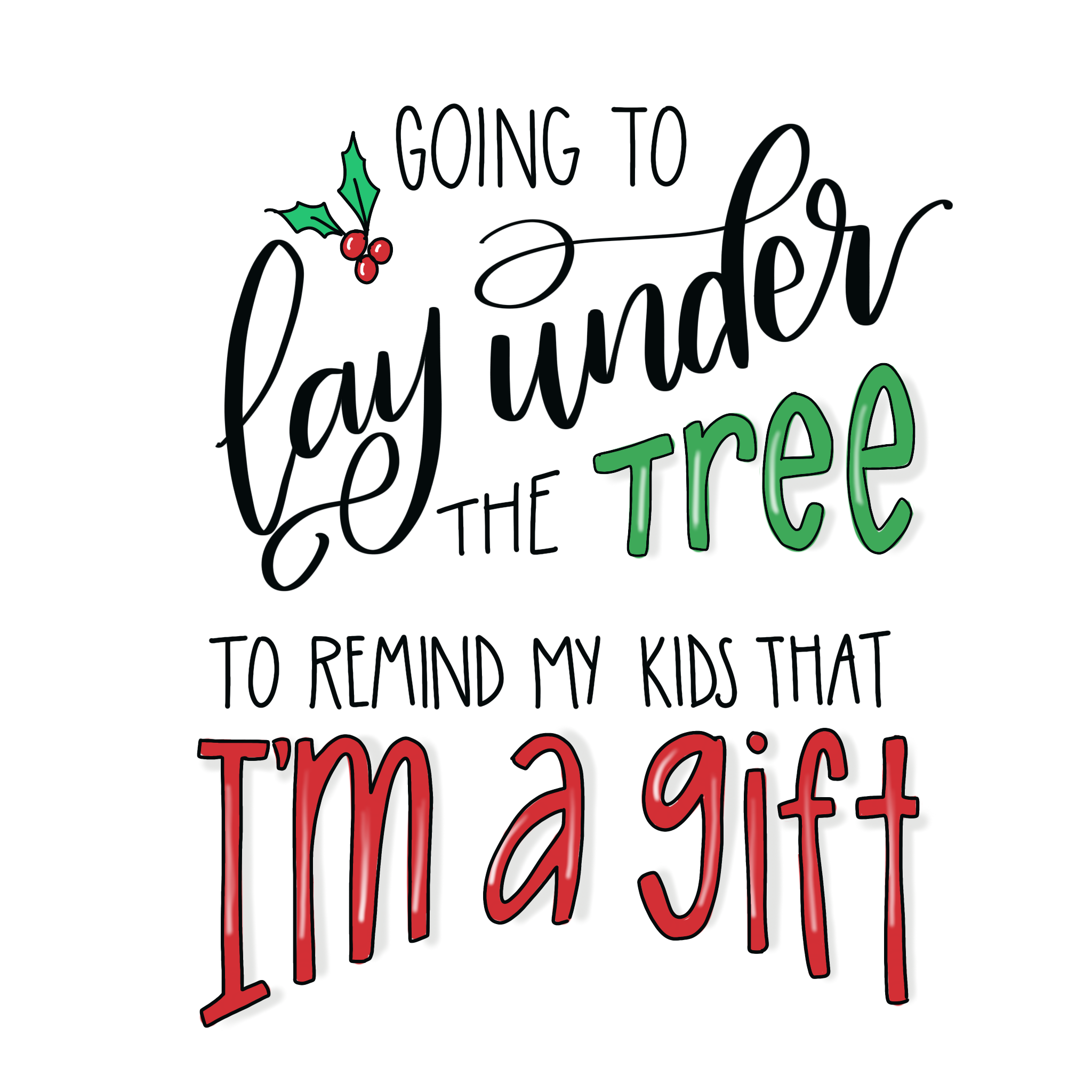
This grid has a straight line of text at the top, then features our triangles. Below those, there’s another straight line of text, and finally the design finishes with a bridge. You could also replace the bridge with a valley if you prefer. Here’s what it looks like when we fill in the shapes with some words.
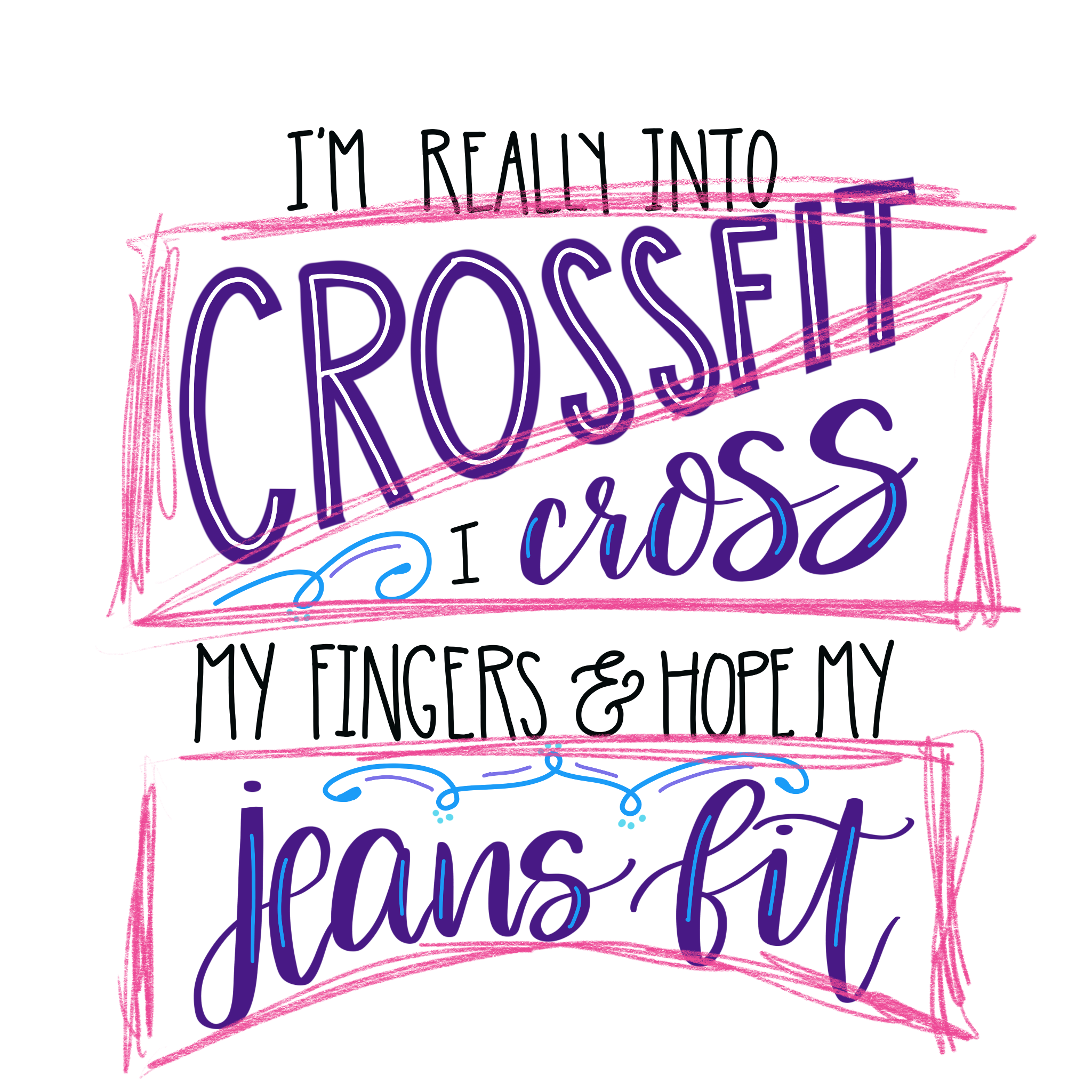
For this first design, I used a Rae Dunn Inspired print for the words I felt were less significant in the phrase. Then, I used Brush Script and some large print letters with highlights to emphasize, “crossfit,” “cross,” and “jeans fit.” I also added color to make those words stand out even more. Finally, I added a few swirl embellishments to fill the empty spaces in the design.
Here’s a totally different phrase I lettered in the same grid. Once again I used that understated Rae Dunn style print for the connector words on the straight lines, then used color and more eye-catching fonts for the words in the triangles and bridge.
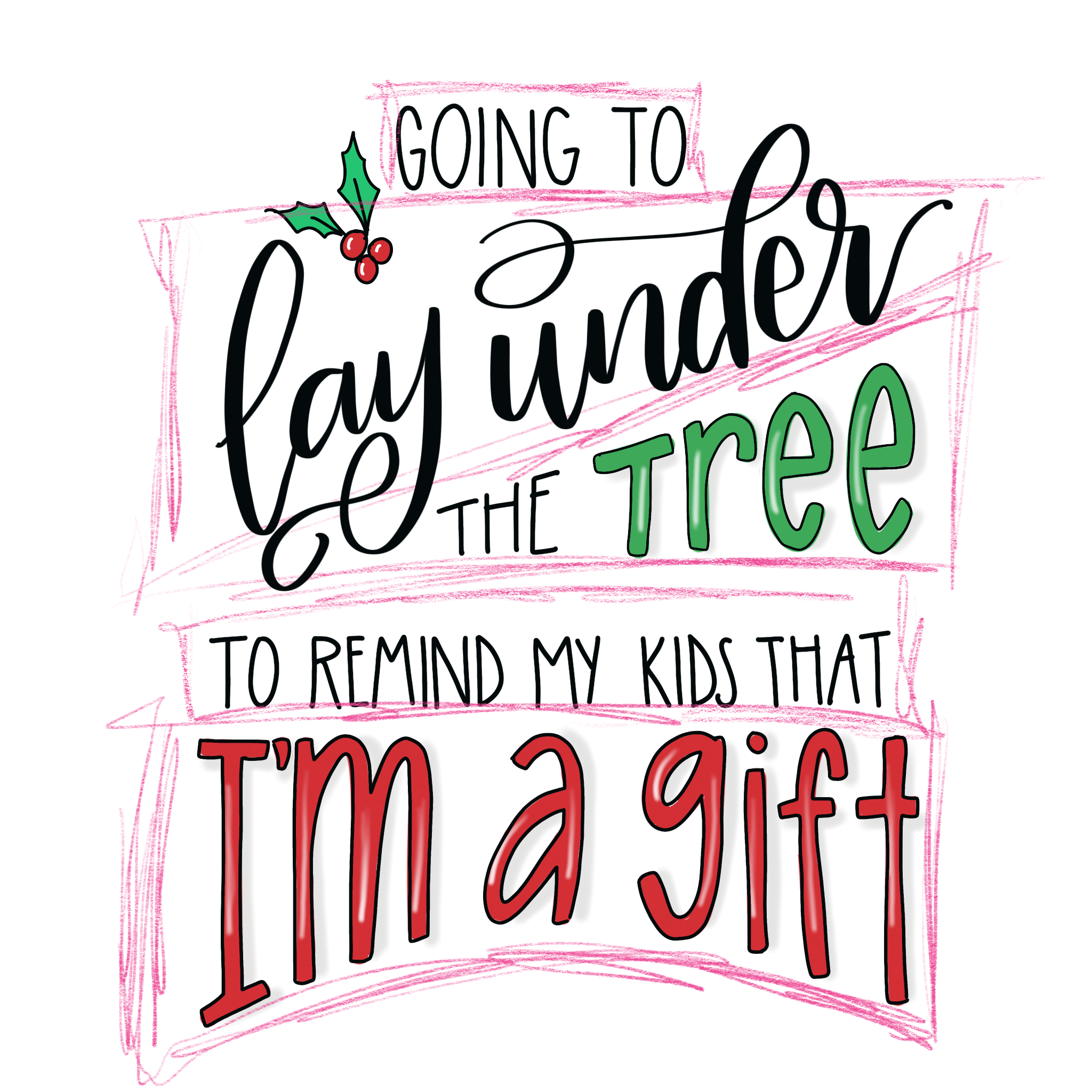
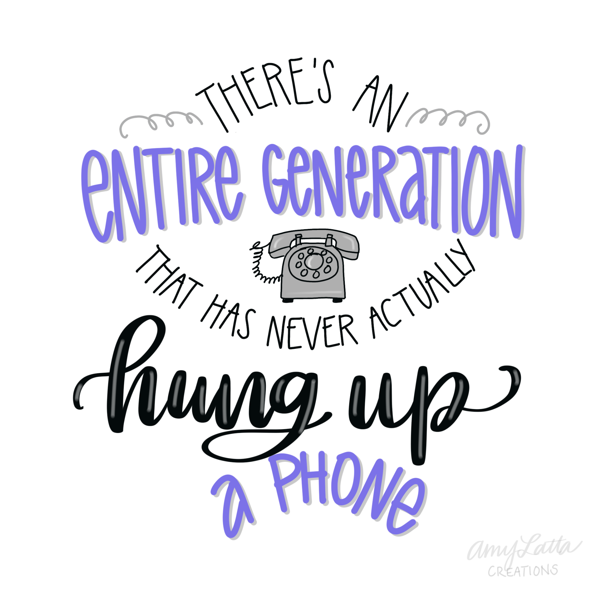
Here’s how it looks when the lines of the design grid are removed. Notice how the shaping of the words creates visual interest and causes the eye to focus on the most important words in the quote.
PRACTICE GRID #2
This grid incorporates all of the shapes, including arches. It starts with an arch, followed by a bridge and an arch going in the opposite direction. Below that is a valley, then one more arch to finish off the design. Here’s what happens when we add some words:
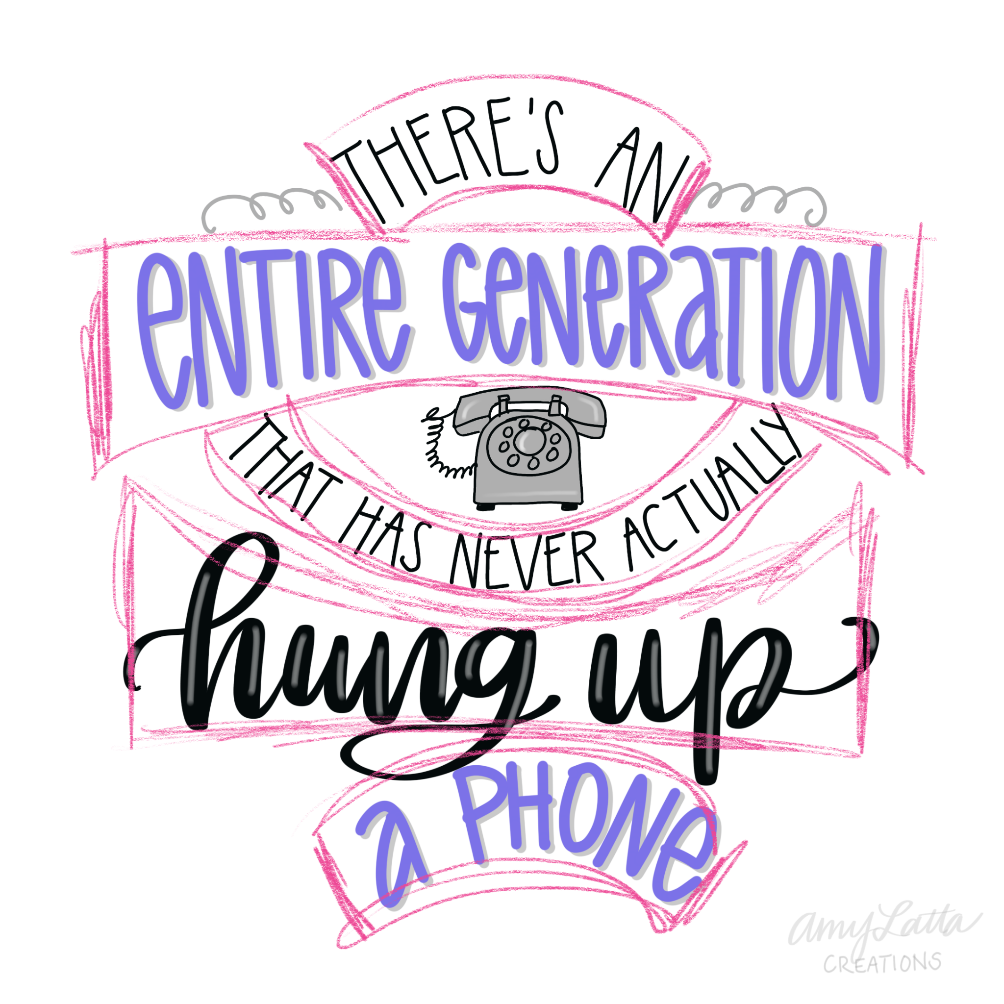
Once again, I added some embellishments, including a little illustration to fill in any blank spaces in the design. This particular layout lends itself to a small illustration between the bridge and the arch below it, where I placed the phone.
With any design grid/thumbnail sketch, the combination of shapes is just a basic guideline to get you started creating something you love. If you don’t like a particular piece of it, change it to suit your preference or the demands of your quote. If you don’t need one of the shapes, you can easily get rid of it! For example, if you have a shorter quote, you can simply eliminate the final arch in the second practice grid.
There are endless possibilities for combining shapes in a thumbnail sketch, but I hope these two examples give you a place to start. Try recreating them with your own supplies and see what happens! I’d love to see how your designs turn out. Be sure to stop by the Amy Latta & Friends Facebook group and share your progress with us. It’s a great place to ask questions and share inspiration. Hope to see you there!
Also, don’t miss these other hand lettering tutorials, free practice pages, and lettering projects!