
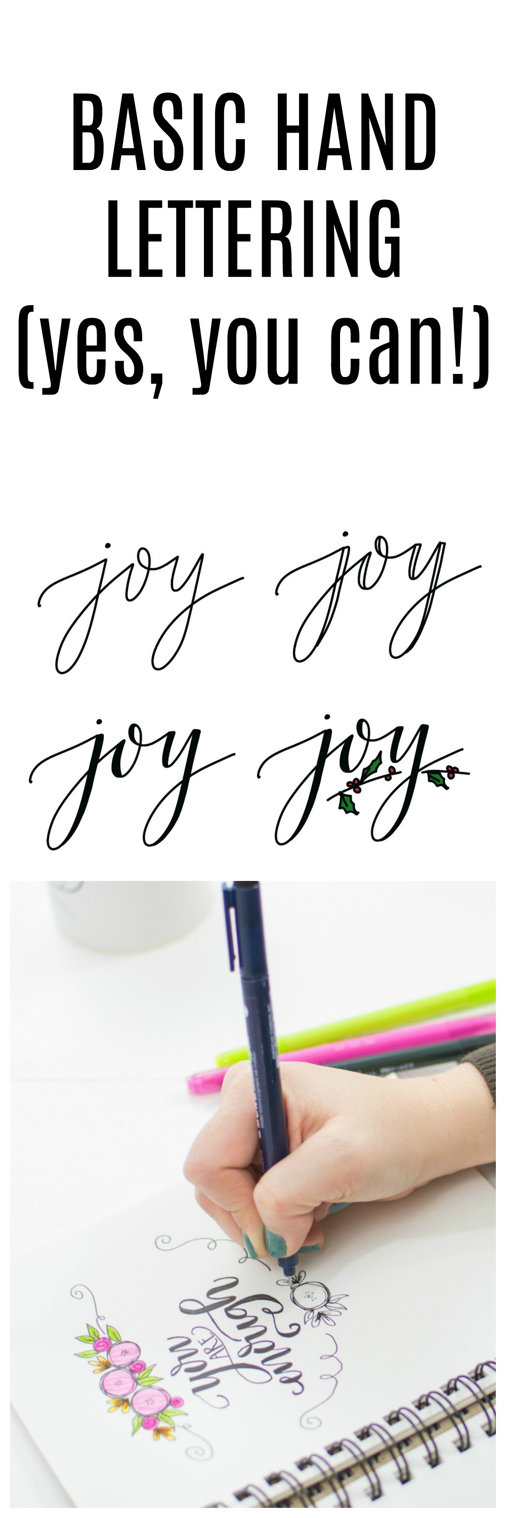
Basic Hand Lettering: JOY
Hand lettering, also known as Modern Calligraphy, is a huge trend in DIY and decor right now, because in our digital world, we don’t want to lose the art of handwriting. There’s something special about putting pen to paper, and we can do it in such a way that we create truly beautiful things. Believe it or not, anyone can learn to hand letter; it’s easier than you think. Today, I want to show you how to get started using just the supplies you have at home.
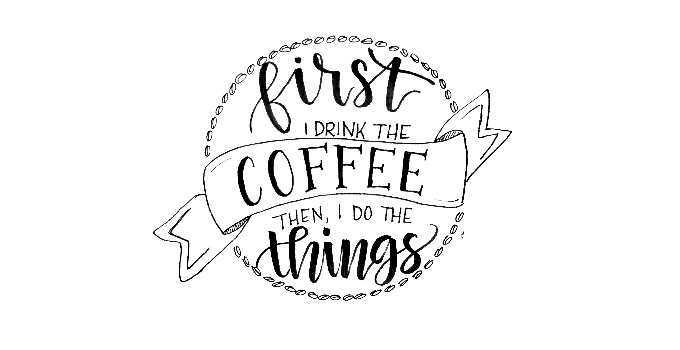
First of all, let me say that no two artists’ work will look exactly the same…that’s what makes it art! Second, there are TONS of ways to do hand-lettering. The most popular style is called “brush script,” which stands out by having a combination of thick and thin lines within each letter. There are two ways to get this look; one is called brush lettering, which is an art technique that requires a brush pen and a lot of practice and patience. For more on that, check out my brush lettering tutorials. If you’re just starting out, though, the best first step is something I call Faux Calligraphy…or “fake it till you make it”! This method is much easier and totally doable for literally anyone!
Materials for Basic Hand Lettering
a sketch book or medium weight drawing paper
a marker or pen (whatever you have around the house will do!)
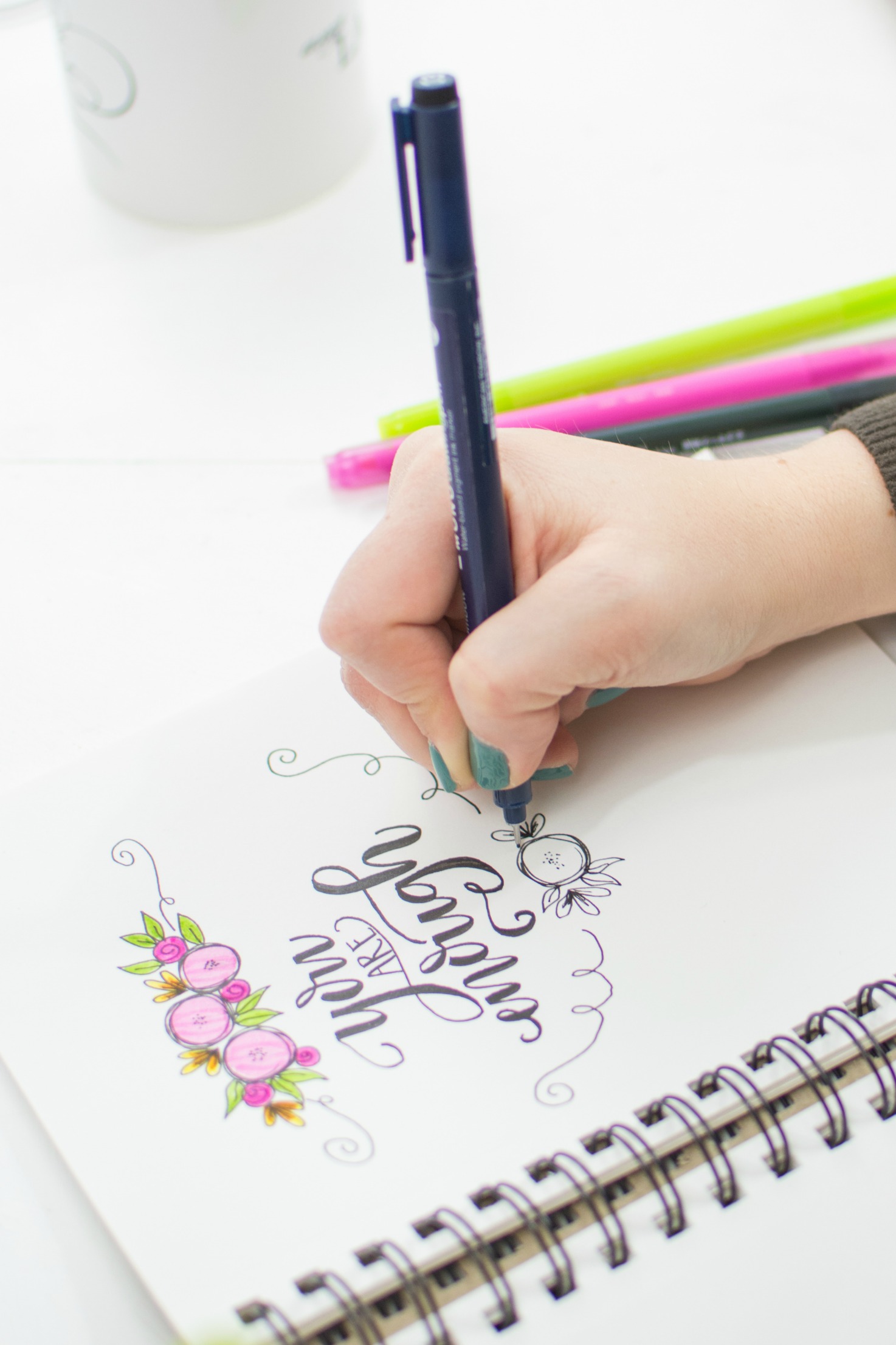
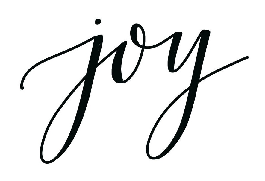
To practice, we’re going to start with a short, simple word…just three letters! With the holidays coming up, it’s likely you might want to use this word on your decorations, cards, and more. Are you ready? It’s JOY! Now, grab your marker and let’s get started.
Getting Started
Step 1: Write “joy” in cursive, leaving a little bit of extra space in between your letters.
You can use as much or as little of a slant as you want. Feel free to play around with it as you practice.
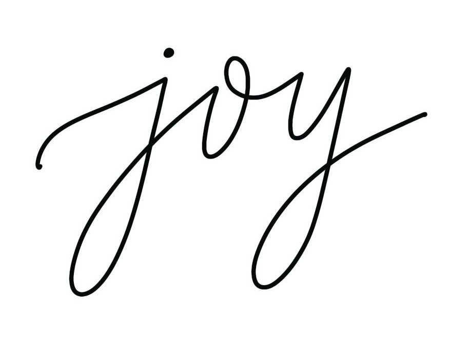
Step 2: Find the down strokes and draw a second line next to them.
What’s a down stroke? It’s anyplace where your marker is moving in a downward direction when you naturally write the word. Anytime you write, your pen is moving in a direction on the page; either up, down, or across. If it’s going down, those are strokes we want to have the appearance of being thicker than the rest. Below, I’ve illustrated for you where those spots are in the word “joy”, but if you want to write a different word, all you have to do is pay attention to where your pen moves down when you write it.
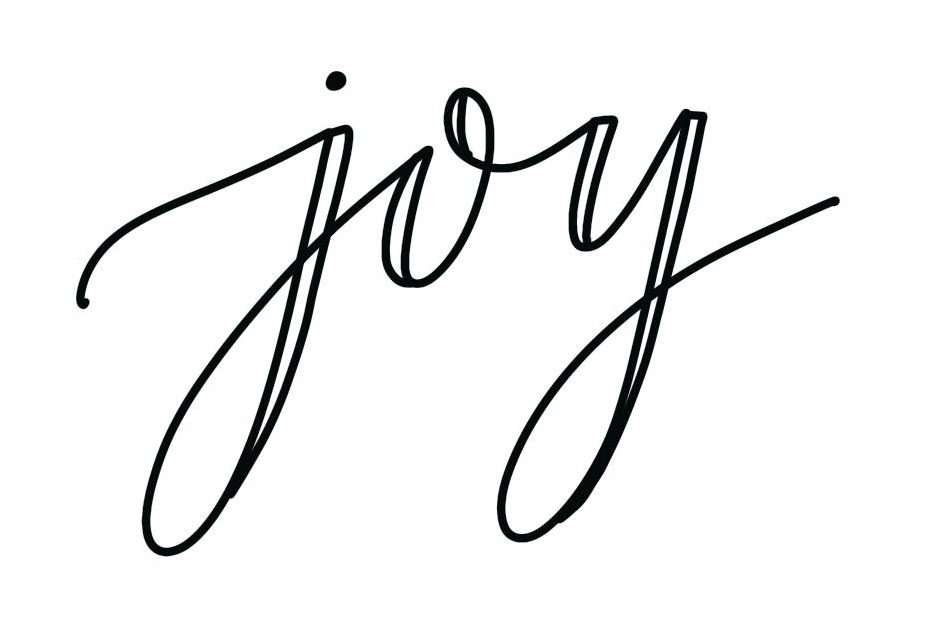
Step 3: Fill in the double line areas with your marker to create the illusion of thicker lines.
In the process, you can make any little corrections you need to if some of your lines were shaky or not quite what you wanted.
Ta-da! There you have it! Your first piece of gorgeous hand-lettering! If you want to make it even fancier, feel free to embellish by adding a little flourish or a doodle. I accented mine with a simple sprig of holly; first I drew a curving line, a few circles, and some leaves, then colored them in. I like drawing curved lines because then I don’t have to worry about them being crooked.

Here’s a photo showing you the full progression side by side.

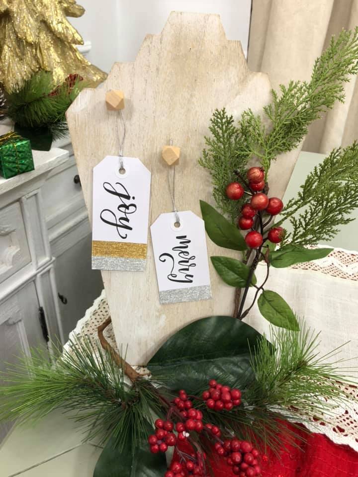
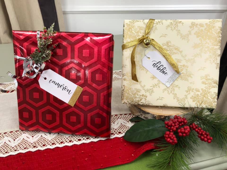
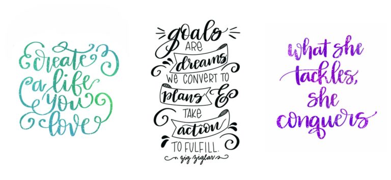
It will most likely take you a little bit of practice to feel comfortable with your lettering, but I promise, the more you try, the better you’ll get…”Practice makes progress!” Once you master writing, “joy,” try other words, like, “peace,” “love,” or your name. Just think how fun this could be when you’re addressing your Christmas cards this year, or making your own gift tags!
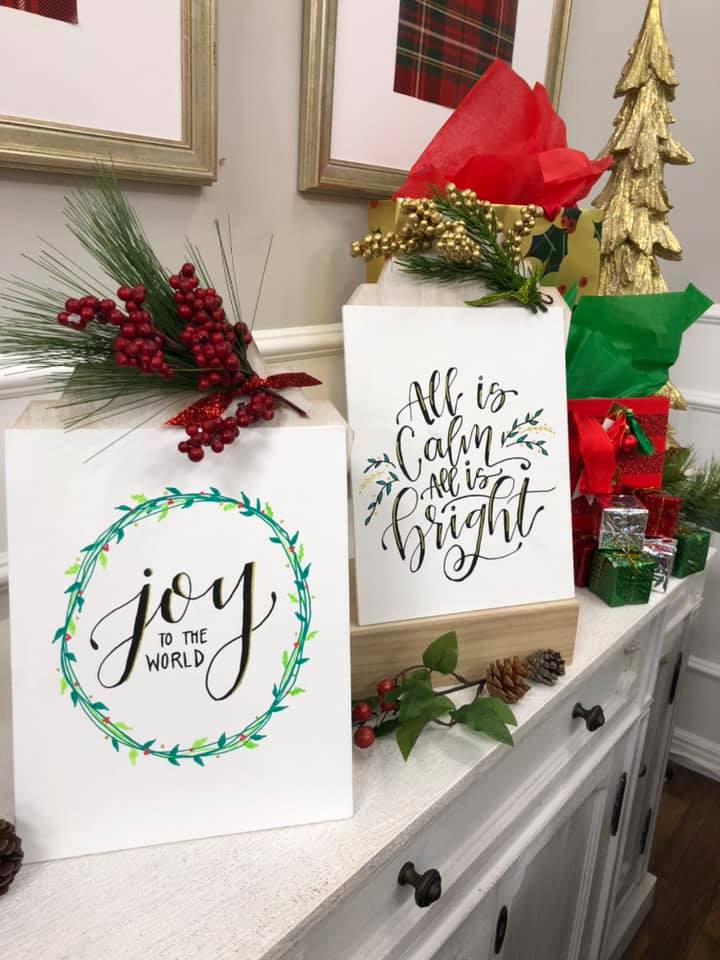
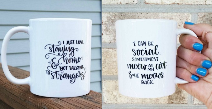
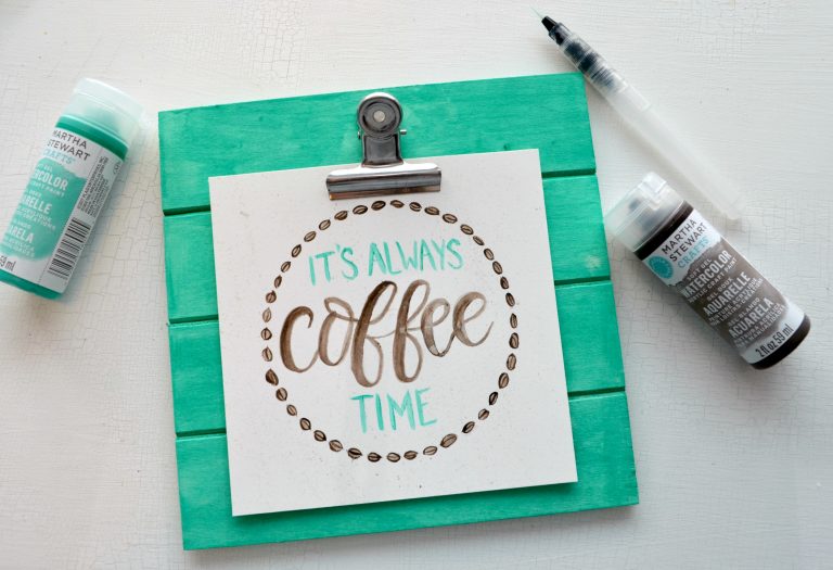
Try it on canvas to make some gorgeous home decor!
I’d love to see your progress; hop on over to the Amy Latta & Friends Facebook group and share your latest hand-lettering projects! Questions? Ask away! And be sure to pin this post for reference later.
Ready to take it a step further? Here are a few more resources:
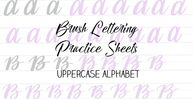
Basic Upper and Lowercase Alphabet
Head here for the rest of my hand lettering tutorials & practice pages!
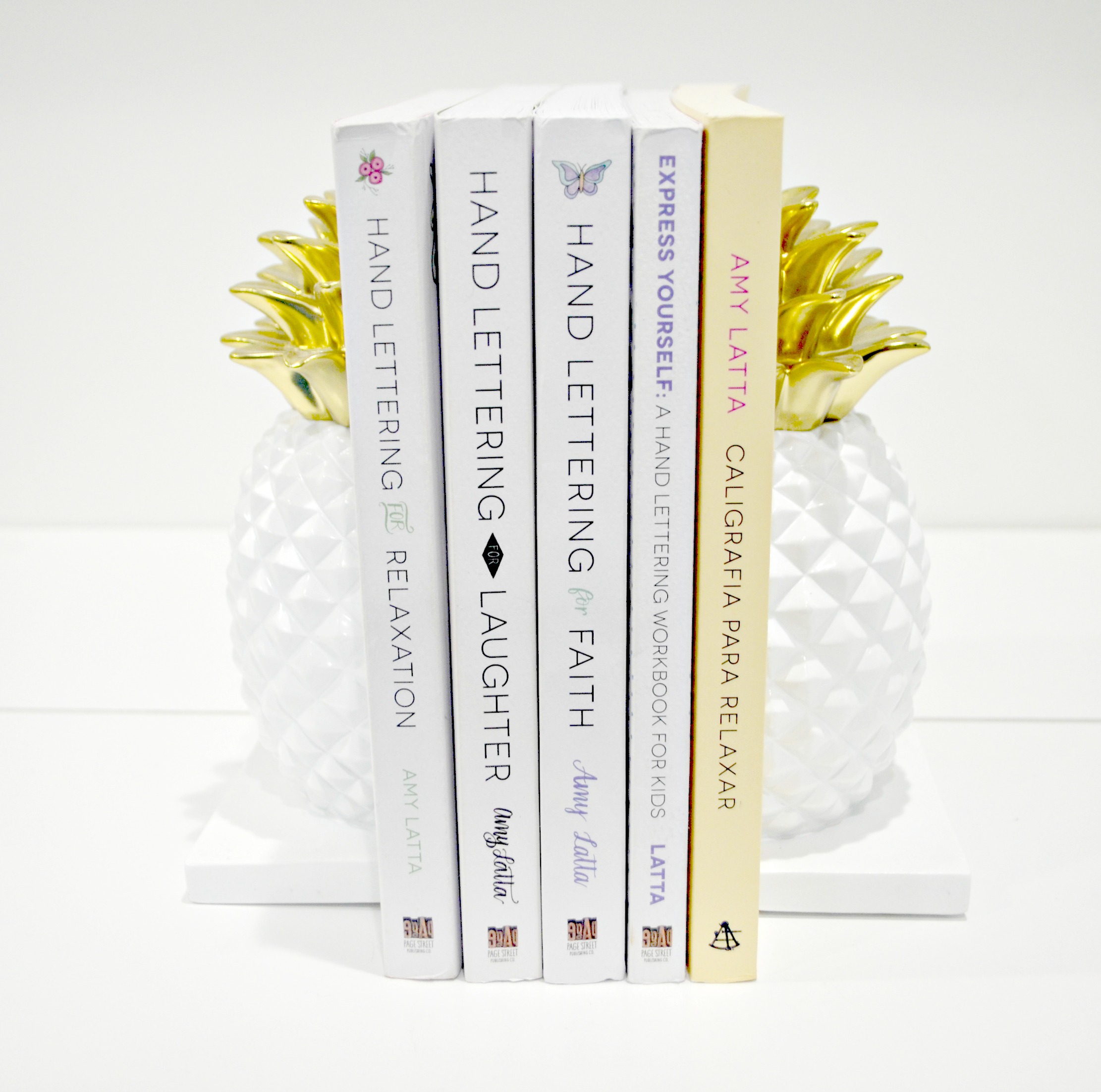
And of course, don’t forget to check out my books!


So cute, Amy! Pinning to my hand-lettering board. Thank you so much for the sweet shoutout! <3 xoxo, Dawn
Thanks Amy for sharing! You made it look so easy. I’m pinning to my Lettering board to share with my friends!
It really is easy! Totally do-able…and just in time for Christmas cards, right?! Thanks for the pin!
Thank you, thank you, thank you. I can’t wait to play around and practice some pretty handwriting. 🙂
Thanks so much! This I can do!!
I LOVE this!! You did such a great job! Now I want to go get my markers out!!
I love this!
Thanks! So glad you stopped by!
This looks so much easier than I thought it would! Thanks so much for sharing! I’ll be using hand lettering to address Christmas cards and packages this year! =)
Thank you for the steps! Now I can write with a more fancy handwriting! 🙂
I am glad I stumbled upon this post in pinterest. I have been going crazy about hand lettering recently and this is really useful. Thank you so much for sharing. Definitely pinning
Oh, hooray! I’m so glad it’s helpful to you!
Thank you!! For sharing such an easy way to make adorable letters! I’ve struggled for so long at pretty lettering on chalkboards. I found your post in the Kim Six Fix Best Posts of the Year post:)
Oh, thank you, Wendi!! I’m so glad you found it helpful!
This was an incredible little exercise I love hand lettering but have always thought it was out of my league now i have proudly written joy and will start working on other words.
Thank you so much!
That means so much to hear, Danielle!!
thank you…this is the first time I think I can actually do this! Great job!
That makes my day! Of course you can do it!! Have fun!
I love looking at your site. Thanks a ton!|
Just found your tutorial on Pinterest.I’ve wanted to learn how to hand letter for a long time. In fact, I bought several Tombow pens. Thank you for such a clear and understandable explananation and illustration. I feel ready to get started.
Aw, thanks so much! So glad you found the tutorial helpful…there are lots more to keep you going!
This is amazing! I was looking for simple ways to just make a person’s name on an envelope (for birthday cards, etc. that aren’t mailed) look less blah. I found you through a google search of “lettering easy.” I am not very artistic, have terrible handwriting in my everyday life, and cannot really draw a straight line. But I have used this as a jumping-off point into your other tutorials, and I’m pretty proud of it the envelopes I have done so far. Thank you so much for sharing your gifts here!
This makes my day! I am so glad you found it helpful!!
Thank you so much for sharing this! I’m just starting to draw, and your post gave me some direction to start trying hand lettering.
I’ve linked to your post in my latest one; hope that’s OK.
You’ll notice I made a mistake when I wrote the word “June,” I emphasized the up strokes instead of the down ones! lol But I’m learning 🙂
http://www.marianamcdougall.com/bullet-journal-experience/
Fantastic! I love it!
My friend got me your hand lettering book for my birthday. It’s my favorite book! I have been learning the ins and outs of lettering but your book showed me all the highlights and shadows. Most lettering tutorials don’t go over that. So I’m pleased with the book & will be publishing a review on my blog on Monday. Thank you!
YAY! I can’t wait to hear what you think! Got a link?
I am left handed, will anything change when I am practicing this method?
A good resource for you would be Dawn Nicole Designs. She’s a lettering artist, blogger, and lefty!
Hi. How do you keep the areas you fill in from being noticeably darker because there are multiple layers?
It all depends on the markers you use. I find that most black markers work well, and the Tombow Dual Brush Pens are good for color. Also, when you color the areas in, try to do just one layer of color in each spot, if that makes sense.
This was sooooo easy to do…. The basics were actually easy unlike other, THANK YOU
I’m so glad to hear it!
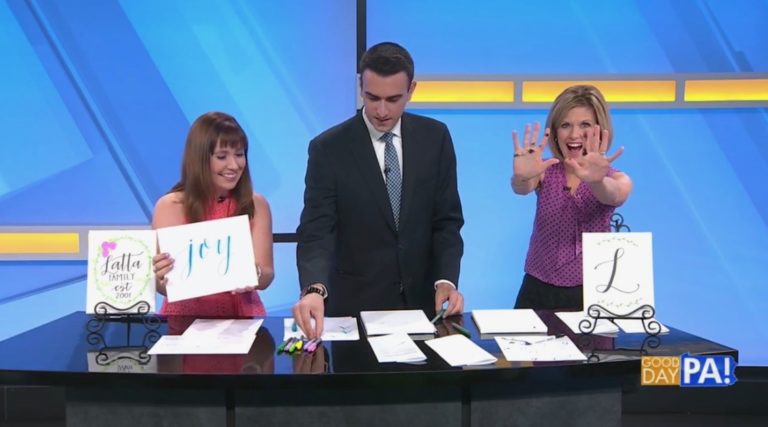
This is wonderful. But my handwriting to begin with is awful. I will have to try this. Saw you on the news this morning. Thanks.
One thing I suggest is treating the letters like you’re drawing specific shapes rather than your normal handwriting. Good luck! Hope you enjoyed the news segment! I’ll be back with a spring craft on April 14!
I’m a total newbie. Where do I start with your books? Laughter or relaxation?
Hi! You can actually start with either book, they’re both designed with all levels of letter-ers in mind. The first book features inspirational quotes, while the second has funny quotes to letter. Relaxation is a bit more basic; Laughter focuses on some design principles as well as the lettering itself. Hope that helps!
I’m so excited to find your website, I tried writing “joy” and can’t wait to learn/practice more! I hope to buy one of your books, including for my children. I love how we can just use regular pens/markers. But if I wanted to add a few simple supplies to go with the purchase of your book(s), what do you recommend? Like just a few markers and paper, what kind would you recommend?
Wonderful! For paper, I recommend a medium weight sketchbook to practice and Bristol Board for finished projects if you want to frame them. I really like the Tombow Dual Brush Pens and the Tombow Fudenosuke. Each of my books have a full list of recommended supplies in the front as well. Happy lettering!
Wonderful article. I really liked the efforts you have put in. This is a perfect guide for poeple interested in calligraphy. I will surely use these tips with my favorite Cedar Markers which will help you create unique, modern art in vibrant shades.
Learned a lot from this article!